A quick run-through of Figma.com’s first run experience. Browse through the screenshots first, and see a quick text summary at the end.
This screen is where new users start signing up for Figma.

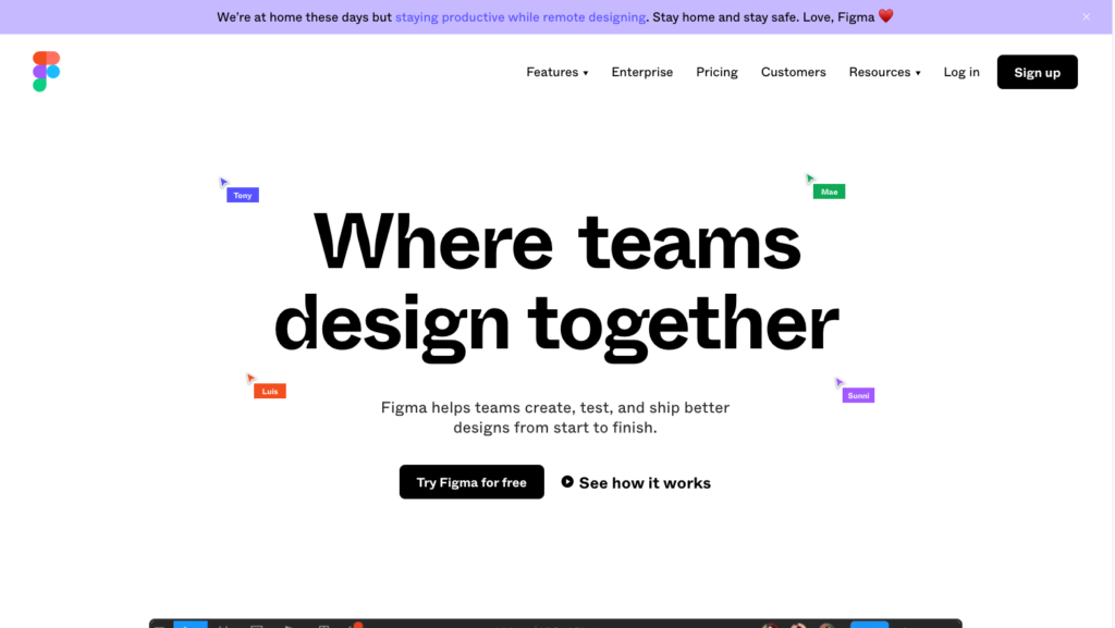
“See how it works” opens a video 
When signing up, new users are asked “What kind of work do you do?” This doesn’t have an immediately detectable effect on the resulting experience. 
After signing up, a new user is asked some questions about their team. 
And then they specify what kind of plan they want 
After selecting their team and plan choices, they see a “You’re all set” screen with an option to be shown around 
…A callout style element points out the team library function… 
…This callout highlights sharing options… 
…And another callout about sharing and collaborating… 
…A callout highlights commenting… 
…Another callout points out the pen tool… 
…This standalone overlay from the tour talks about an export function, which isn’t visible on the current state of the screen… 
…Another standalone overlay describes device mirroring… 
…And the final overlay describes the file browser, which isn’t visible on this screen
The good bits:
- Figma offers free, unlimited use of the product for an individual after they sign up. This lets new users try it out for as long as is necessary before they decide to purchase a license for their team, instead of rushing them by capping the free version to 30 days. This “free sample” also makes for easier onboarding of people who might receive an occasional one-off Figma file link when consulting with larger companies.
- The introductory tooltip tour is optional, and otherwise new users are immediately delivered into the full experience of the product so that they can start working straight away.
To be improved:
- At signup, new users are asked the question, “what kind of work do you do?” This question seems to have no detectable impact on the new user’s experience once they arrive into the product, so it feels like unnecessary work.
- The first view a signed-up user has of the product is the individual project view, instead of seeing the main project browsing interface. This can make it difficult for someone to understand the hierarchy between a single project file and the main project list.
- Although the introductory tooltip tour of the interface is optional, it has no signposting or quit option once started.
- A few tooltips reference concepts that aren’t related to content on the current screen. For example, the final tour screen talks about navigating files in the project browser, which is not something a user can do on the current screen.
- The first file the new user arrives on is completely empty; there could be an opportunity to let new users choose to start with a pre-populated example file, instead of being delivered to an empty space.