


The good bits:
- Foursquare doesn’t try to overload new users with many concepts presented in any intro tour. While it does frontload some information, this information is focused on a single concept–the idea of frontloaded content or an intro tour. Instead, it focuses the new user on a single concept, which is the use of a person’s tastes and likes to drive recommendations in the app.
- As part of this introduction, Foursquare lets the new user interact early by offering a selection of tags used to personalize the app to her tastes.
- After signing in, there is a brief loading screen that is lightly personalized by showing the first letter of the user’s name.
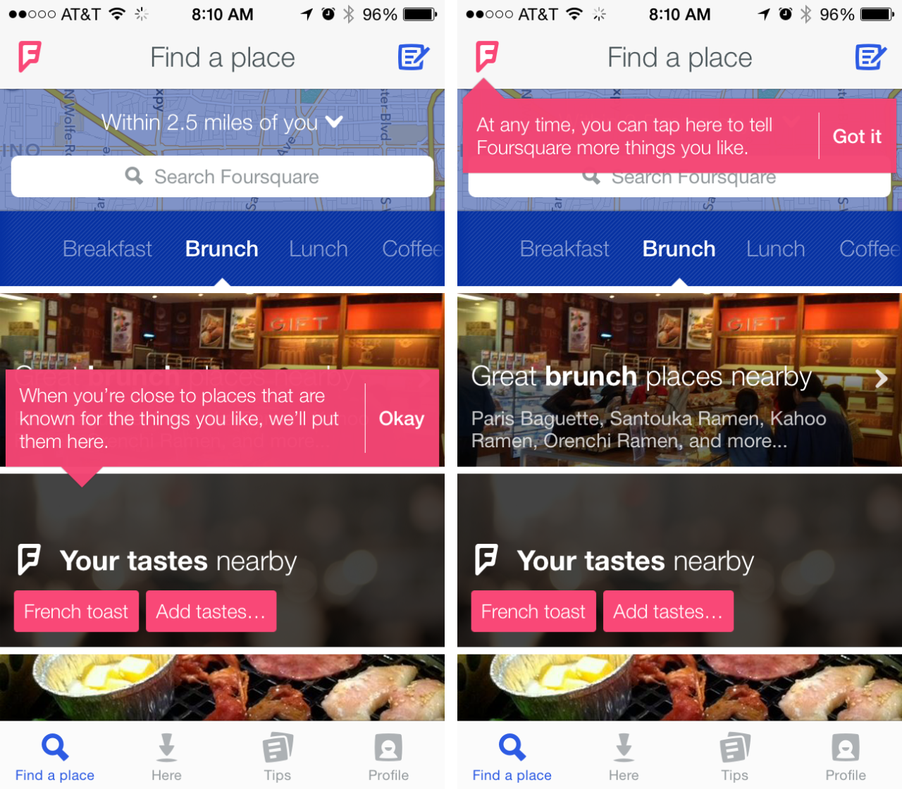
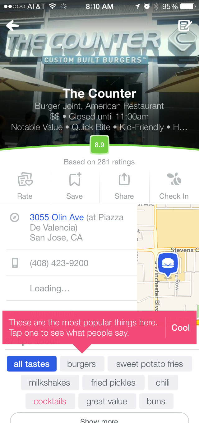
- Once in the app, Foursquare leverages as-you-go tooltips to call out portions of the experience that might be of interest. These apply teachings in context, and also can be leveraged as platform for continued learning
To be improved:
- Foursquare forces sign-in before a user can view any listings. Although this requirement is deferred until after she selects her “likes”, this means there is a point of interruption before she can see how those likes pay off. It also raises privacy questions before the new user may be sold on the app itself.
- After signing in, the new user still may not be able to see the results she has been waiting for if her phone’s preferences are not set to allow Foursquare to use her location. Instead, she will see a prompt to change her preferences, be required to manually traverse the Privacy settings tree, and then exit Settings and re-enter the Foursquare app.
- Although the user-guided tutorial approach to tooltips is better than frontloading this information, some of the tooltips are seemingly obvious, which can detract from how their importance is perceived. For example, the tooltip explaining ratings might be unnecessary.