This is the first run experience of Loom, an online video recording platform. This first experience is from the perspective of someone who came to Loom directly of their own motivation, to record a presentation video for a virtual event. Other new users to this product could be those invited to view an existing video, or heads of an organization hoping to get their teams using this tool.
Getting started with the service
The Loom homepage emphasizes a “Get Loom for Free” call to action, and the top space on the page includes a high level note and animation about its offering: “Record quick videos of your screen and cam. An essential tool for hybrid workplaces.”
Scrolling further down the page reveals some lightweight examples of other features, but these are mostly abstract. For example, one feature section is labelled “Be yourself,” but this doesn’t directly speak to a specific feature or use case of the product. The elements of the landing page all seem to be indirectly speaking to the benefits of asynchronous video, but the asynchronous nature of Loom is not explicitly stated on it.


New users will likely be looking for their use case to be represented, but they have to navigate to another page to see use cases the product supports. Use cases help new users begin envisioning how this tool might fit into their workflows, so it could be beneficial to weave more examples into the home page.
As a side note: it was only when drilling into “Loom for Team Alignment” that the asynchronous video nature of Loom was explicitly addressed.


Signup flow: “Get Loom for Free”
Tapping “Get Loom For Free” takes users directly into a signup flow. There’s no concrete overview of the features being signed up for at this stage and no indication that Loom has different service tiers on the home page. Still, new users are put into the signup flow for a mid-tier Business option, and the only way to know this is by the text at the very bottom of the signup screen that says, “Start with a 14-day trial of Loom Business.”

There’s a completely free tier of Loom with a different set of features, but you would have had to have manually visited the “Pricing” link from the site navigation.

Why might this be problematic? Because, later on in the trial experience, you’ll start getting warnings about being “downgraded” if you don’t pay for the full version. That could be very confusing for someone who didn’t know there were multiple options.
OK, let’s get back to the signup flow. It’s a 2-part structure: choose an account method (such as social sign-in or email signup), and then complete that option.


There’s some inconsistency with messaging and labels on both these screens. On the first part, the value proposition text “Share updates, feedback, and ideas with video messaging” doesn’t match any of the messaging from the homepage of the product. There could be an opportunity to adjust the messaging based on the page and context people came from. Meanwhile, the second page is titled “What is your name?” but there are multiple fields to fill out, not just name.
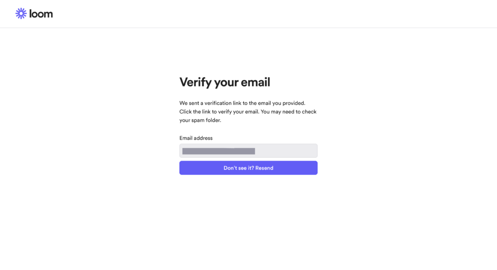
I chose to sign up with email. So I was blocked from proceeding by a page requiring me to go into my email and verify my account. This can be a point of significant drop-off for new users. The product could consider still letting people proceed, and give them a time window to verify within in parallel.

Account setup
Signing up and verifying your email is not the end of the process. Before you get into the product, you need to complete a 4-part account setup flow.

The first question is a choice about what someone is using Loom for. The options are “At work,” “For education,” and “For personal use.” According to the text on the screen, this selection is used primarily to serve the user with resources and videos tailored to their selected use case later on. This is helpful; it’s much better to give users a reason to select into categories, rather than just asking for it and assuming they’ll understand the value of it. But, back to that in a bit. Depending on the option you select, you see different, brief descriptors of how each role uses Loom. This is information that could also be useful earlier in the process, before signup.


Be cautious when forcing users to put themselves into a specific role. Many people may perform many jobs, which can lead to arbitrary choices. And if you personalise the experience based on their choice, they could be locked into a very narrow window of options when they could also benefit from options shown to people who are in other roles. I chose “For work: Marketing” as my option.
I also noted that this setup flow does not offer any way to go back to revisit previous choices. And I was unable to find a place in Settings downstream in the product to change my reason for using Loom. Up-front setup flows should have clear ways for users to revisit their choices, either in the context of the flow itself or downstream in the main product experience.
Proceeding on with the setup flow, the 2nd and 3rd steps require setting up a workspace name and inviting collaborators. I don’t know if this would still be prompted if you chose “Personal” as your use case in step one; because I couldn’t go back to change my choice, I did not have a way to find out.
The last step is optional, and is a prompt to download the desktop app or install a Chrome extension. These come with reasonably detailed descriptions of their purposes. This is the first place where the product actually indicates it can be integrated with other products, and the first time where specific features were clearly listed — but they might be ignored because it’s buried in small text here.

Finally, proceeding past this step allows you to get to the main product. Ultimately, the two flows (for signing up for an account, and then setting up the account) are visually disconnected from each other and interrupted by email verification, which can lead to new users perceiving this process as prolonged and tedious.
First view of the Loom web tool
Completing the account setup flow redirects new users to the primary view of the Loom web tool. In my case, 2 separate prompts immediately appeared: one was a banner at the top of the screen requesting I download the app or get the Chrome extension (since I didn’t do that at the end of setup); the other is a “Get started” checklist that pops up in the corner with another request to install the app or Chrome extension. Be cautious of using overlays and plugins to show setup steps, as they can compete with each other because they are not situationally aware of what each other is asking a user to do. Here, it’s resulted in repetition of the same requests.

Behind these prompts, I had a simple empty state message in the “Videos” tab. Weirdly, when I refreshed this tab, then some videos appeared in this empty state. These videos show some examples of how Loom is used, and seem to have been suggested based on my earlier choice of “Marketing” as my use case in the setup flow. This is a good example of delivering value shortly after someone answers questions during setup flows; if you ask questions without delivering any obvious value, then people will just think you asked them for internal demographics collection purposes, which can prevent their answering of any other questions later. It’s unclear however why it took a tab refresh for these to appear.

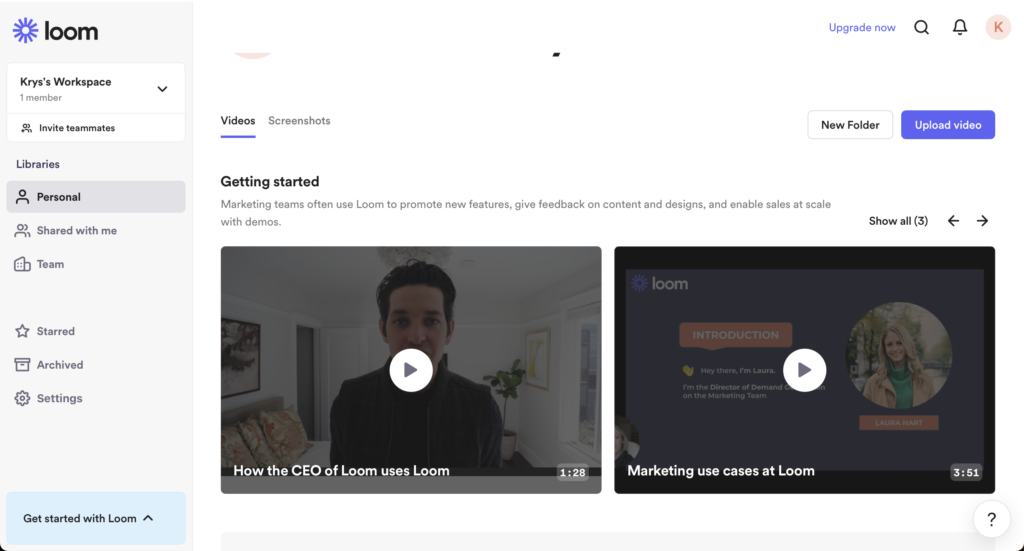
The only downside with the videos is that there’s no clear way to dismiss or get rid of them (turns out, later, they go away once you record your own video). Additionally, one of the videos is a “How the CEO uses Loom” video, which doesn’t really seem very specific to the “Marketing” use case I’d selected earlier.
The checklist
I iterated through the checklist to see what else was suggested. I’m not a fan of checklists, because they’re often a random assortment of individual features that aren’t tightly related, or they represent an unrealistic, ideal path we wish all users would take. But most of Loom’s checklist does a good job focusing only on the core, obvious activities that are involved: recording a video, sharing it, and getting feedback (a view). Each step is directly actionable, which is much better than showing passive information or instructions. Some actions are disabled until the previous checklist item is completed, but shows a tooltip explaining why it’s disabled.


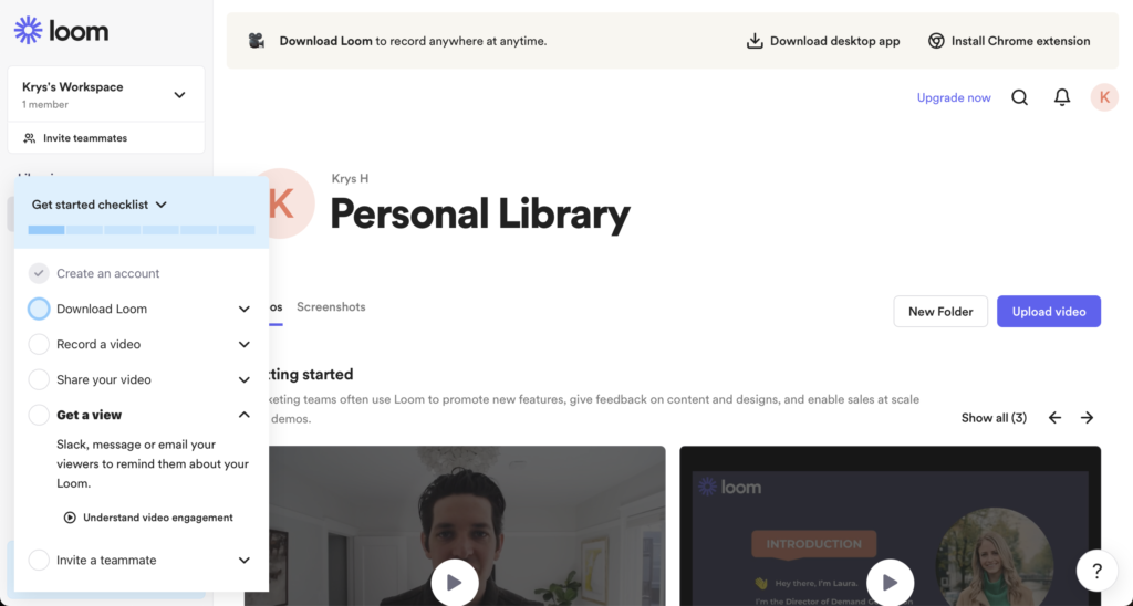

“Invite a teammate” might not belong in this checklist because you can probably achieve that through the process of sharing the video, and it’s not a required part of the primary flow. You can see that this is true, as well, as it’s the one action that remains enabled and is not dependent on the earlier steps. If you must have a checklist, keep it limited to the essentials all users will need so that it doesn’t get unwieldy.
Despite all the good stuff I said about the checklist, I ended up collapsing it without acting on it directly. I didn’t really want to do an entire video sharing workflow from the constrained space of the checklist, instead wanting to use the “full” interface. And this is another caveat with popup checklists: they’re displaced from the main interface of the product, and may not help users understand how to repeat the workflow later.
Web tool empty states
After closing the checklist, I navigated around the interface a bit more. The screenshots tab has no empty state, which makes it difficult to predict what this section will be used for.

The “Shared with me” page, and other pages, at least have informative empty states.

The team library section reuses the same videos from the Personal section in its empty state.

Setting up the desktop app
Earlier, I’d mentioned that account signup and setup wasn’t the end of the user’s setup journey. That’s because you need to either use the desktop app or the Chrome extension to actually start adding videos to Loom. I chose the desktop app.
The first view of the desktop app when launching it after installation is a small signin screen. I also encountered an immediate prompt to enable microphone access, even before I’d signed in.

Once signing in, I was greeted with an 8-step setup carousel.
This setup flow was a mix of education and permissions setup. The first 3 screens show and tell about features, but this information is quickly forgotten because the subsequent 5 steps require users to shift focus on a myriad of MacOS permissions, including those that require digging through MacOS security preferences. Avoid lumping passive education screens in with setup steps, as users cannot task switch effectively nor take action on those educational screens, and usually this means they forget all about them because their attention will be spent on the active setup screens.


The app did handle the permissions steps very well: Each request was prefaced by an explanation of why the permission was necessary; each step deep-linked directly to the relevant prompt or settings screen; and each gave feedback after the step was successfully completed. This repeating pattern did start to feel a bit tedious after a while, however, because of the number of permissions required, so there’s opportunity to perhaps load both mic and camera permissions into the same step.
Getting past this marks the end of Loom setup flows. This experience involved 3 separate setup experiences (creating an account, setting up the account, and setting up the desktop app), each with their own design, cadence, and messaging. Products should unify and streamline product setup flows to reduce the context switching of new users and reduce the chance they’ll get frustrated and drop off. For example, perhaps a new user of Loom doesn’t need to go through an explicit account setup flow, but those questions could be moved into the empty states of the core web tool.
Recording the first video
After set, users can record their first video. The main interface appears over their desktop screen allowing them to choose different recording options, along with player controls and an avatar bubble at the bottom corner of the screen.
On the main interface, there is an inline prompt to enable notifications. On the avatar bubble, there are 2 callouts: one telling the user to click a people icon to switch between their camera and screen, the other simply saying “new” and highlighting a present icon, but no description of what it’s for. Everything is new to a new user, so it is odd to have to call this out.


Once “start recording” is tapped, there’s a one-time message pointing to the recording controllers (docked by default to the left hand side of the screen). The recording kicks off once “Got it” is tapped. This message appears only on the first time through; recordings start immediately after clicking “Start recording” for subsequent uses.
Once the recording is finished and the user hits the Stop action, the Loom website opens in a browser window, taking them to the video in their Videos tab. Editing controls are immediately exposed, as well as an editable title field and reactions bar. This post-recording interface makes it clear what actions can be done in post with no displaced, passive education getting in the way. The “Share” icon at the top of the screen is also emphasized, and we can see in the bottom left of the screen that I’ve completed the second item (Record a video) in the checklist.

Users also get an email congratulating them on their first recording, encouraging them to take the next step by sharing it if they haven’t already.

Onboarding emails
Loom leverages a number of onboarding emails for new users. In addition to the “verify your email” message, and the successful recording email, new users will get a number of them, especially if they aren’t taking action in the product.
The first email that everyone gets is an initial welcome email. This includes a video and next steps. Interestingly, there’s more clarity in this email about the need for a recording tool and links to use cases than there were revealed on the product homepage or initial states of the product.

If the user doesn’t download the desktop app within a few days, they’ll get a reminder email.

A day or two later, an email mentioning Loom video can integrate with other apps, like Gmail and Slack, appears in the user’s inbox.

If the new user gets close to their 14-day trial end date without upgrading, they’ll get an email warning them that they’ll have to pay to upgrade to keep the features they were introduced to, or be downgraded. If a new user hadn’t manually explored pricing options before signing up for the free trial, this email might be a surprise to them.

If the user also hasn’t recorded a video by this date, they’ll get an email right before their trial end encouraging them to record a video, with an included case study.

And if the user ultimately doesn’t act, they’ll get an email confirming that they’ve been “downgraded.”

The email strategy Loom employs is probably the most unified and concerted onboarding effort across the other setup and instructional techniques they’ve employed. Some of the other surfaces of their interface may benefit from having the information offered in email forms woven in.