


The above screenshots show my first time experience getting set up with the website side of Slack, a team communication management tool. Screens from the more limited iPhone app to come shortly.
The good bits:
- Slack breaks down the initial team setup into a well-messaged wizard. Each of the steps in this wizard is focused on one requested piece of information (ie, “Team Name”, “Team URL”, and so on).
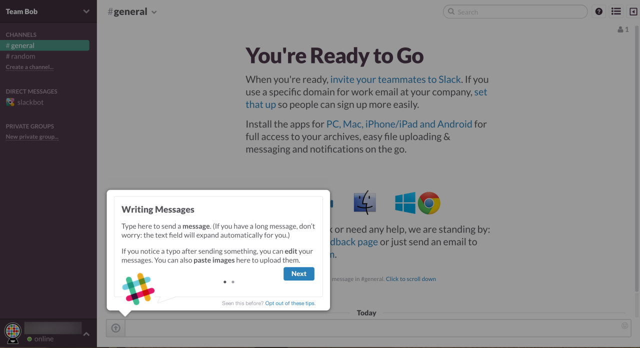
- At the end of the setup wizard, Slack transitions nicely into its primary view. There is the option to scroll through a 3-panel tour which is incorporated into the blank slate area of the center screen. Because it is inline with the rest of the content, it allows exploration of other areas of the interface.
- While there are several tooltips, they are modeless and can be opted out of.
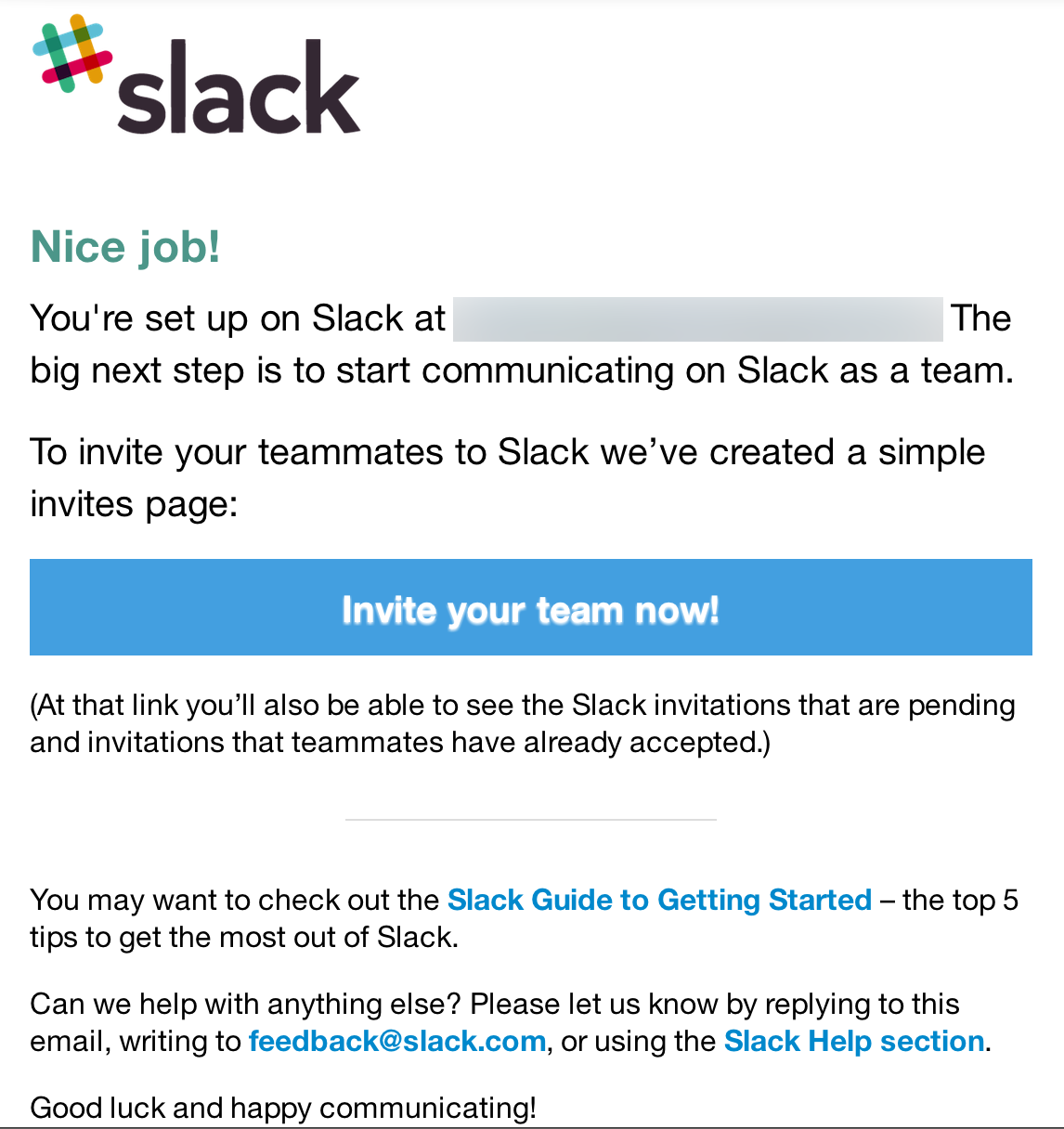
- Slack provides motivational next steps and sets expectations through multiple communication channels: the product tour points out other apps team members may want to download; “Slackbot” sends an automatic message to introduce direct messaging; and the post-setup email suggests inviting more members to the team.
To be improved:
- Slack is an invitation-only service with no sample functionality provided up front. Potential users are required to sign up and wait for an email allowing them to continue (usually this takes several days). This “pay and wait” approach may cause many to rethink their choice, even if they’re paying with their information instead of money.
- While Slack’s messaging is friendly, it often instantiates as large chunks of text that can make it hard to parse important information. For example, while there are only 3 tooltips in the initial tour, each tooltip has enough text to require multi-panel scrolling. In general, there appears to be overuse of multi-panel scrolling, likely for this reason.