This post is a runthrough of the first use experience of ChatGPT, an AI conversation bot from the OpenAI research lab.
Handling server overload on first visit
ChatGPT has gotten a lot of media attention, and the number of people visiting the site to try it out sometimes overwhelms its servers. This could put a damper on their first impressions. Luckily, these sorts of delay and error states can be opportunities to guide new users, and it seems the OpenAI team has taken advantage of this.
If the ChatGPT servers are busy when a new user first arrives, the page they land on lets the user see ChatGPT in action. A randomly generated prompt appears at the top of the page asking the bot to write out a response about its current status in a type of writing format. The response is gradually printed out on the screen by the bot. Refreshing the page will show a new prompt and response.


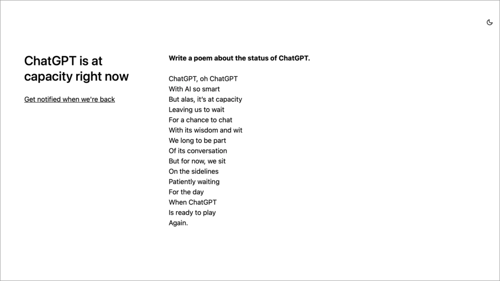
These examples give new users a glimpse into the range of responses the bot can generate.
Alternatively, if people don’t want to wait, they’re given an actionable way to deal with this error: They can choose to be notified when the servers are available.
Signing up for an account
Oddly, if you land on the website and the servers are available for use, there are no examples of ChatGPT in action. Instead, new users are shown a sparse screen requesting that they log in or create an account. No other information or examples of the service are provided. This screen could benefit from some richer demonstrative content before requiring people to create an account.

It may also be difficult for newcomers to understand why an account is required at all. Not understanding the purpose of information being requested can lead people to provide throwaway information. Moreso, folks may be worried that their personal information will be used by the bot itself. It would be helpful if there was content on this page to clarify why an account is necessary and how it will be used.
The signup flow after the initial log in/sign up screen is equally sparse, but does provide good validation and form feedback. The step design is also concise, with no more than one action per step.

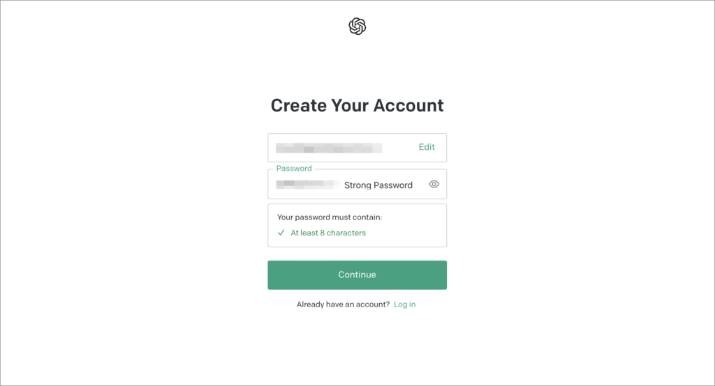
If the account was set up using an email address, the new user will be asked to verify it. This can create a potential point for drop-off in the flow. It can be a better strategy in some cases to defer email verification until after someone has succeeded in setting things up.
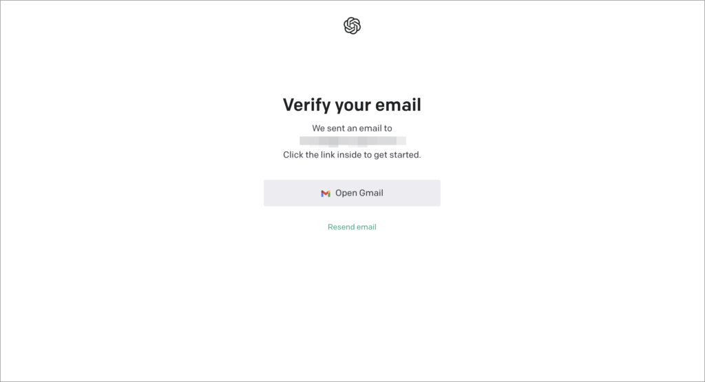
At the very least, the “Verify your email” page gives the user a quick link to open the email service associated with the email address they provided. This at least can cut down on the chance they’ll get distracted by other things in their inbox. Of course, this assuming the person is already logged into their email and ready to jump into it…

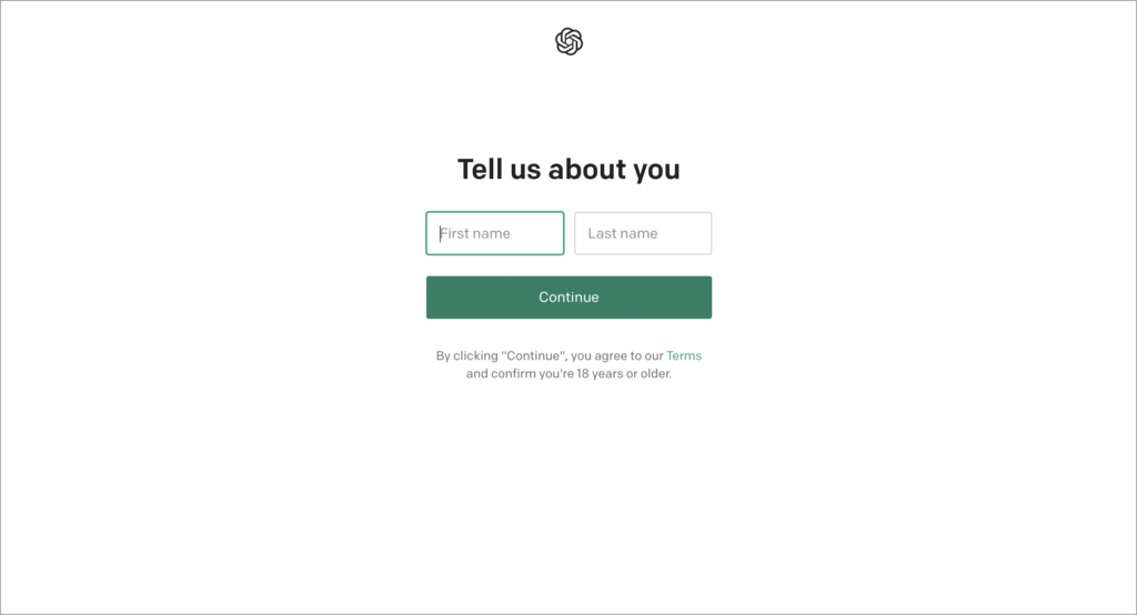
When the email address is verified, the landing page directs the user into a second half of account setup. First, the new user is asked to provide their first and last name.
Also on this step, there is small text at the bottom stating that hitting the “Continue” button means accepting the terms of service and confirming that the user’s age is 18 or over. This is a very late-stage moment to be revealing terms of service and age restrictions; typically these are better stated more prominently before someone starts into a signup flow with their information.
The final step of account setup is to provide a phone number for verification purposes. The need for this is also unclear: why does this service need both a phone number and an email address for verification purposes? No explanation is provided.

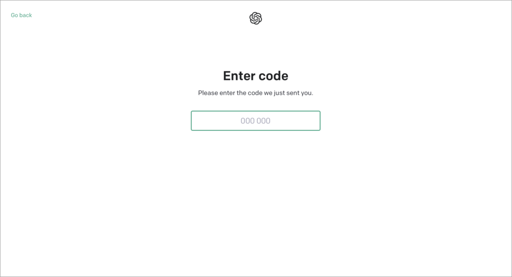
Upon verifying the phone number, account setup is completed and new users are redirected to the home page of the ChatGPT experience.
First chat with ChatGPT
Completing setup redirects users to the home page of the ChatGPT experience. Immediately, 2 modal dialogs pop up in sequence.
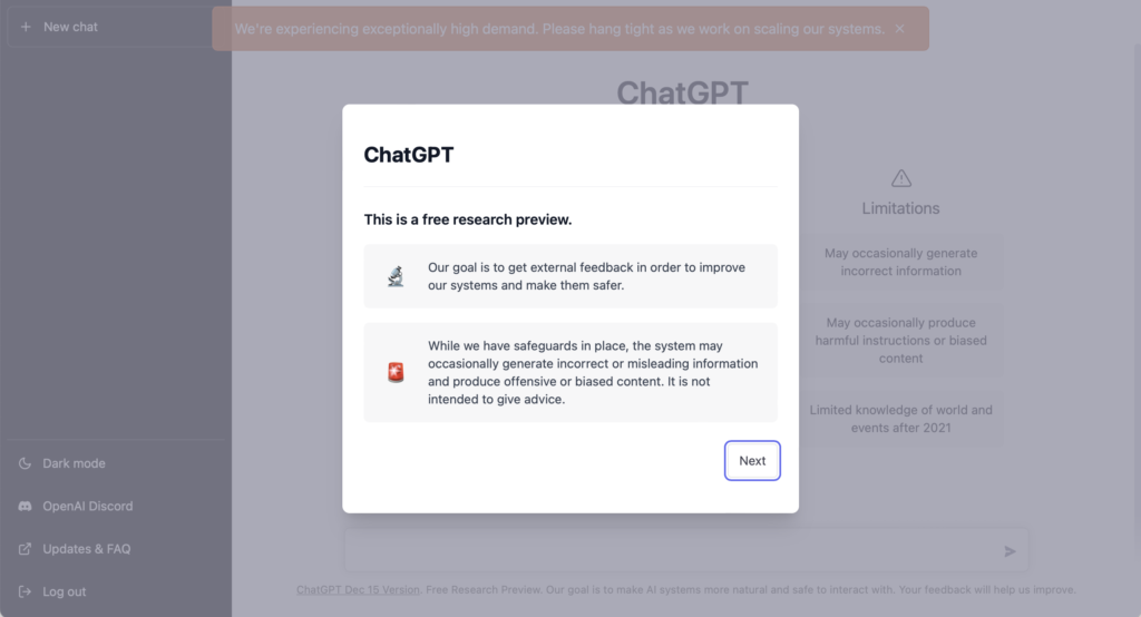

The first lets the user know that ChatGPT is currently a research preview, being distributed in order to find ways to improve, and provides some hedging about the fact that some responses may be inaccurate or misleading. The second introduces 2 channels for providing feedback: Via a thumbs up/down affordance in conversations, or through the ChatGPT Discord.
Putting core information into first-run popups is generally not a good idea, as people can quickly dismiss the dialogs and forget the information. Luckily, some pieces of information introduced in the dialog — such as the Discord server link — are still present in the main interface.
Dismissing the popups shows a central dashboard area with some prompts inline (and, in this case, also a warning banner about server capacity).

The homepage of ChatGPT paints a picture of what can be done with the service, with inline information about its capabilities and limitations. It’s a great way of using default page design to guide users, without the use of tacked-on elements. It would be even better to be able to see even more example prompts in the “Examples” column. And perhaps the modules under the “Capabilities” and “Limitations” columns could be clicked to reveal even more details about how the AI underlying ChatGPT works and why these limitations and capabilities exist.
When coming to this page, however, it’s not immediately clear what is actionable. First, it might not even be clear to a new user that they need to initiate the first chat, rather than having ChatGPT being the one to proactively start one. Second, it was also not immediately clear how to start a new chat.
The way to create a new chat is to type a prompt into a message bar at the very bottom of the screen. However, it’s so far outside the visual focus area of the page, that it’s easy to miss, even with the cursor already in focus in that field by default. Part of this is an issue with the fields in-focus state not looking any visually different than its non-focus state (at least on Safari). Personally, I tried first tapping the “+ New chat” button in the top left of the side navigation panel, as that’s where my attention first was drawn, but nothing happened. Finally, I pressed one of the “Examples” modules and saw it populate the empty message bar at the bottom of the screen, and that’s when I realized that was where new chats started.
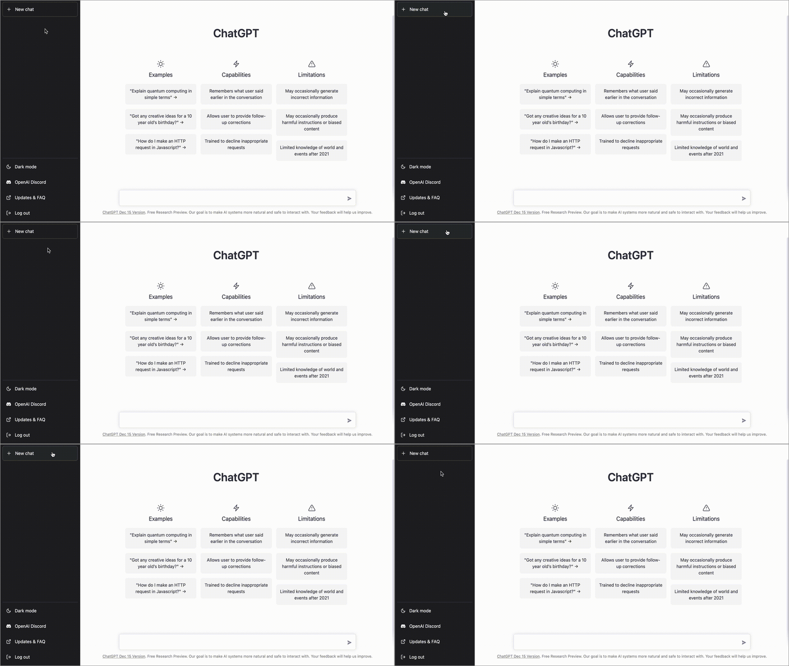
Some initial cue text in the bottom bar, even if there was already a cursor in focus, could help clarify that it is an interactive element.
One other opportunity for improvement is to provide even more examples in the “Examples” column, as there are thousands of possible ideas that people could try out, and only 3 selected on this page.

Each new chat gets an entry in the left hand side navigation and a focused page in the middle of the screen. This makes it easy to get back to any previous chat you started. Every time ChatGPT responds, you can hit a thumbs up/down button to give people feedback that helps control the system. This can help new users feel a sense of control over automated content.


Summary
- When servers are overloaded, ChatGPT does a good job showing the new user examples and giving them the option to be notified when it’s available to use.
- The home page after signing up for ChatGPT has inline information helping give the new user a sense of the capabilities and limitations of the service, without requiring them to read that information in a disembodied place like a modal dialog.
- If servers aren’t busy, new users are just taken to a sparse log in/sign up page. They aren’t provided any examples of ChatGPT in action and are given no way to try it out for themselves. It could be a better opportunity to provide more information and even ideally, an interactive demo.
- While setup had simple steps, it lacked clarity as to what was being signed up for and how information would be used. There wasn’t much in the way selling the service.
- After setting up an account, there could be many more examples of prompts provided on the main ChatGPT conversation page to inspire people with how to get started and why they should keep coming back.
- It’s not immediately clear how someone starts a new conversation with ChatGPT, as the main text field is visually less prominent than the other elements on the screen.
To learn how to make the first run experience, and the rest of the onboarding journey, better in your product, pick up a copy of Better Onboarding from A Book Apart.