In this post, I’ll look at the first run and setup experience for Libby, an app that lets people borrow and access digital content from their local library.
Summary:
The good bits:
- Libby allows new users to explore a full range of available content without needing a Libby account or even a library card. All they need to do is pick a local library to see rich, curated content, which makes their first experience with the product immediately more actionable.
- Setup for various things (like a library card and notifications) is distributed across the experience with multiple entry points, instead of all being demanded up front.
- A lot of guidance is presented inline on pages instead of as separate (and easily-dismissable) overlays. For example, the setup flow for signing in to a library account is handled entirely in line within the Home tab, borrowing flow, or Settings tab.
To be improved:
- There are some concepts, like the Shelf, that aren’t clearly introduced. The empty state of the Shelf, in particular, could better indicate what the Shelf is and, instead of telling people to go somewhere else to populate the Shelf tab with content, could instead bring actions for doing that into the empty state itself.
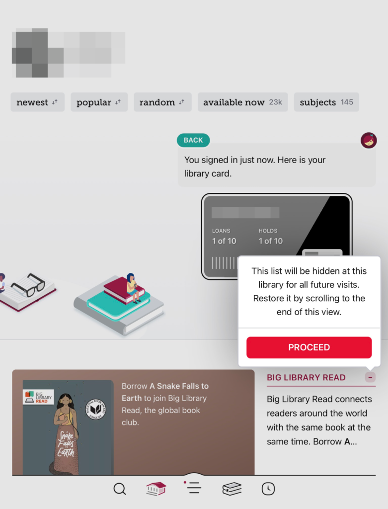
- Some labels could be improved to be more actionable and less clinical for new users. For example, “Manage notifications” isn’t as clear that it’s about enabling notifications. And “Proceed” is a weird confirmation action label when trying to customize your Home tab.
Starting out in the app
First, the app opens with a minimalist, chat agent-style setup flow. There’s an initial message about what Libby offers, followed by a prompt to respond with whether or not you have a library card already.

If you choose that you don’t have a card yet, the chat-style agent then responds with tips about how to sign up for a card, and then directs you down a path to “Find Libraries Nearby.” It’s not clear at this point that you can use the app in some form without a library card (it turns out you can).
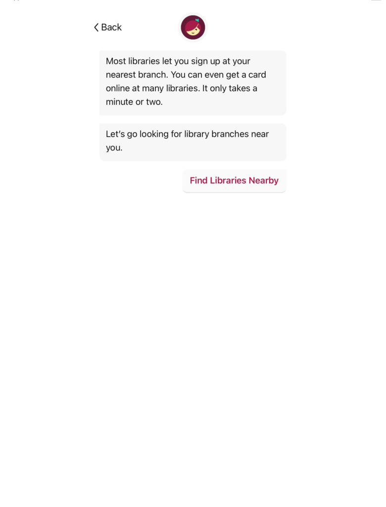
When choosing “Find Libraries Nearby”, location permission is requested so that Libby can find a nearby library. What’s nice about this is that it asks before popping up the standard system prompt, and also provides an alternative to search for a library manually.

Choosing “Yes, Use My Location” pops up the standard system location prompt.

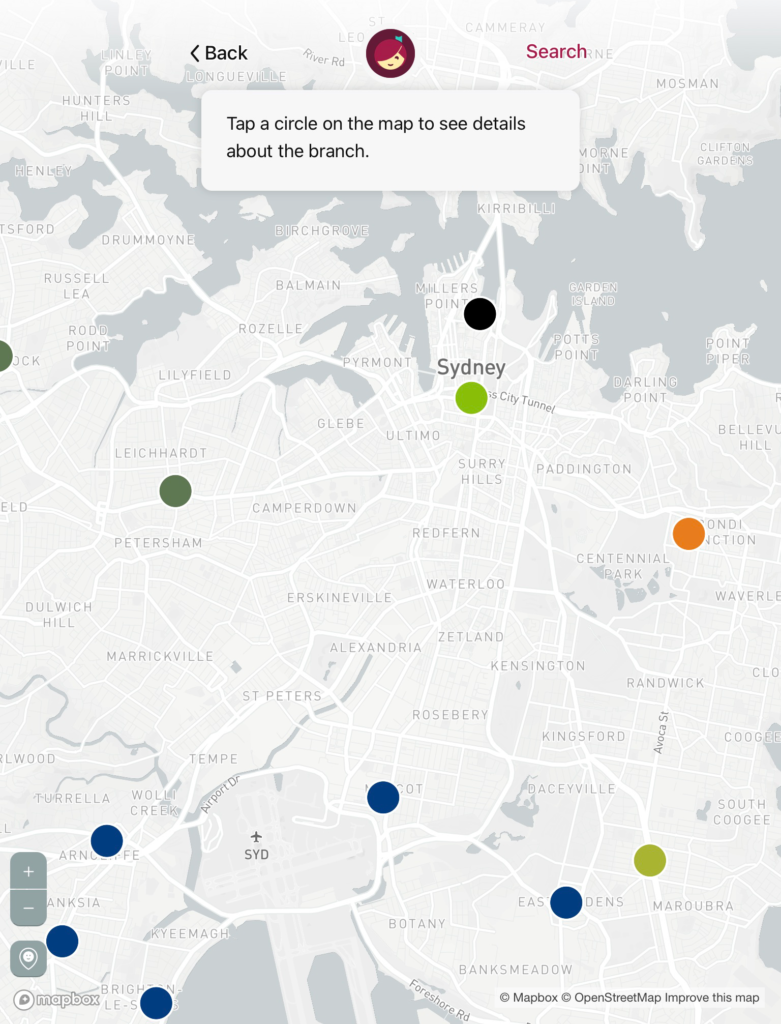
Once location access is granted, the app will render some local libraries as dots on a map. The chat agent says “Tap a circle on the map to see details about the branch.” You can tap any dot to see more details and set a library as your default.

Once you navigate through the maps (or a manual search) to choose a local library, the app finally completes this initial setup, and loads the Home tab and main app navigation.
This Home tab shows rich, curated content from the local library, which is impressive considering the number of different libraries that the app probably has to scale to support. Even though I hadn’t added my library card yet, there’s still an entry point to add a library card near the top of this screen, as indicated by the little inline chat agent message: “Add a library card for [selected library] so you can borrow titles and place holds.”

While the home page is richly populated, the initial states of some other tabs leave much to be desired. For example, the empty state of the “Shelf” tab is sparse and uses only a tiny coach mark telling someone to go to another tab and search for books. It doesn’t actually make it clear that the Shelf is where people will look to see books they’ve borrowed. This would have been a much better opportunity to bring the action of searching into the Shelf itself and to be clearer that this is where loans will live.

Borrowing a book for the first time
When you go to search for a book, the borrowing flow integrates prompts and reminders that a library card is needed to borrow a book. In this case I searched for a book called Drop Bear. We can see that I have the option to initiate the borrowing flow, even without a library card, but there’s a visual hint that I’ll need the card as indicated by a card icon with a “plus” sign overlapping it.

If I choose “Borrow,” I’m taking to a new page with options for signing in with a card (the app only requires an account in the form of a library card; no centralized Libby account is required) or to get a card.

Choosing “I Would Like A Card” sends me to the library’s website for ordering a library card. I’ll spare you that flow; let’s assume that I ordered a library card, received it, and have come back to the app to borrow this book.
Now that I have a card, I will choose “Sign in with my card.”

Once I enter my library card number, a second field for entering my card pin is revealed.

The instructions in this flow do a pretty good job of expanding inline to support the variety of formats a library card might appear in. Presumably there might be different fields that would be exposed for different kinds of cards.
Once you enter your card info and press “sign in,” the card details area refreshes to show that the information is being processed. What’s great about this experience so far is that the user has never had to leave this borrowing flow to go through the various steps of getting set up — every state appears inline on the same page.

Eventually, my library card account is confirmed and it appears under the book I want to borrow. The next actions I can take are to edit the card (such as by naming it), or “Next,” which presumably returns me to the borrowing flow.
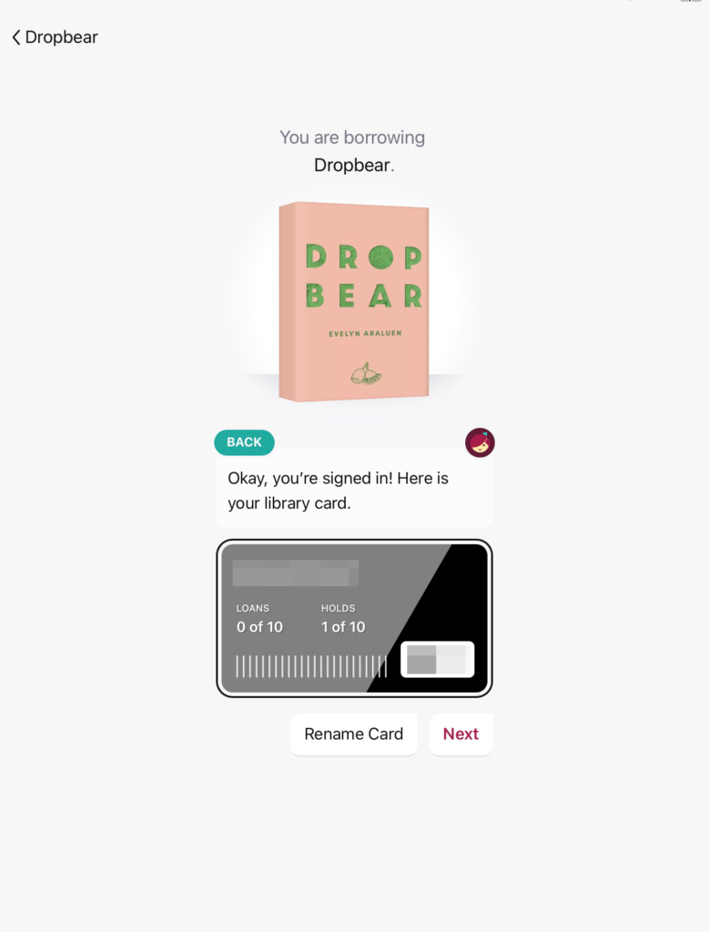
Hitting “Next” updates the page inline and reveals a large “Borrow” button

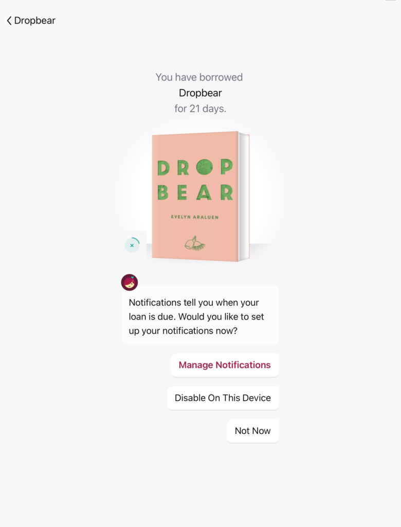
Pressing “Borrow” then updates the page with a confirmation state that I have successfully borrowed the book. And here we see another inline prompt as a follow-up: A suggestion to turn on notifications (“Manage notifications,” perhaps not the clearest or most actionable label) in order to be reminded when their loan is due back.
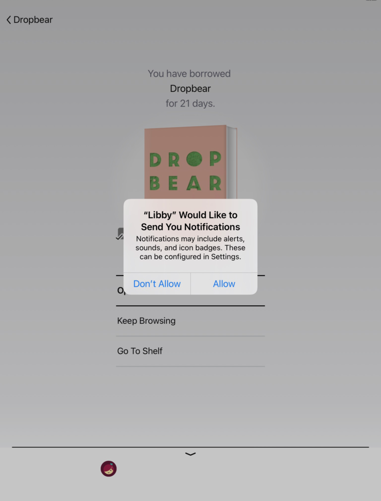
If notifications are allowed, the page updates inline and now shows a standard set of next steps that someone can take — they can start reading their borrowed book, keep browsing for new books, or “Go To Shelf.” At this point, the Shelf may still be a confusing concept (it’s never formally introduced as the place where borrowed books will live), so this is something that might be confusing to people.
But also notice that a sheet has appeared at the bottom of the page, inviting you to tweak the way that you’re notified about different things. Swiping up reveals a number of options and details about how notifications can be handled. This settings screen has a lot of great, embedded guidance, including a snippet at the bottom of the page that shows what the different notifications types are.

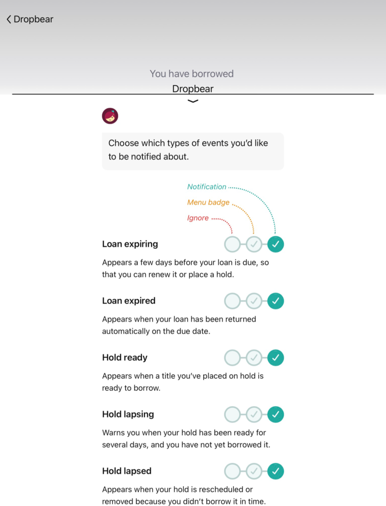
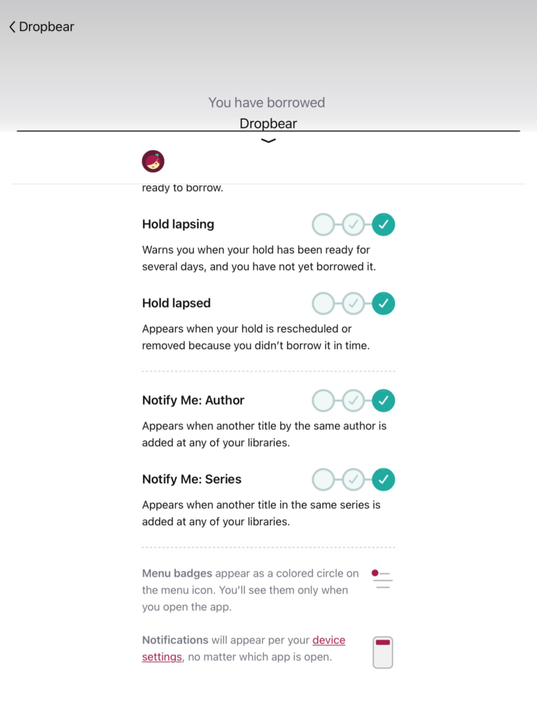
What’s nice about this panel is that it wasn’t created just for this one-time enablement of notifications; it’s simply porting in the same information and options as normally lives in the app’s Settings.

If I return to theHome tab after having added my card to the app during the borrowing flow, we can see that it has updated to show my card.
You can also start customizing the Home tab at this point. For example, by removing some of the curated content sections the app displays for a given library by default.
