
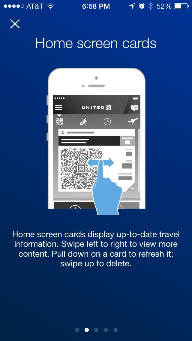
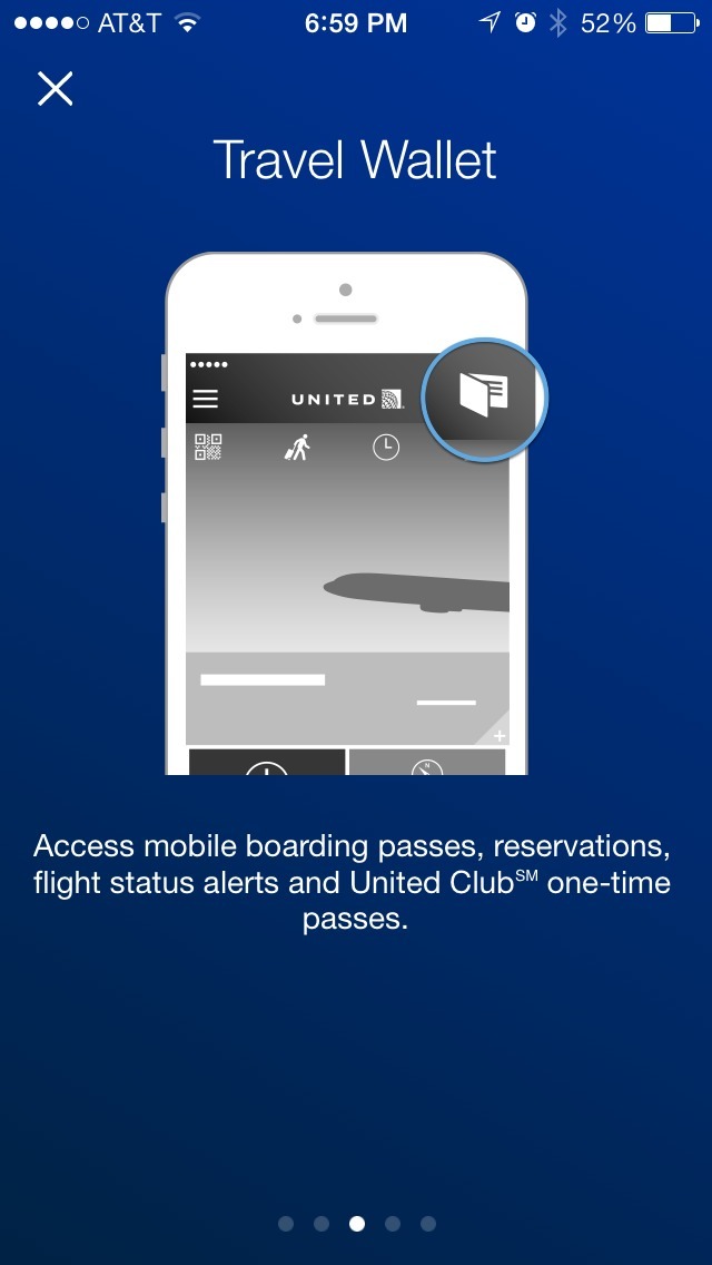
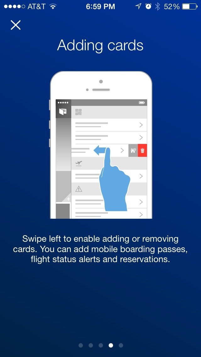
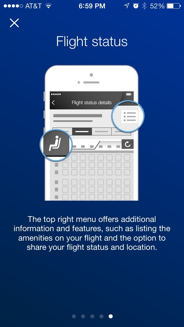
The above screens show the first time user experience for the United Airlines iPhone app. Like so (too?) many apps, it utilizes a multi-page, swipable intro walkthrough.
The good bits:
The app offers an “x” in the upper left corner throughout the intro screens, so it can be dismissed at any time instead of forcing users to go through them.
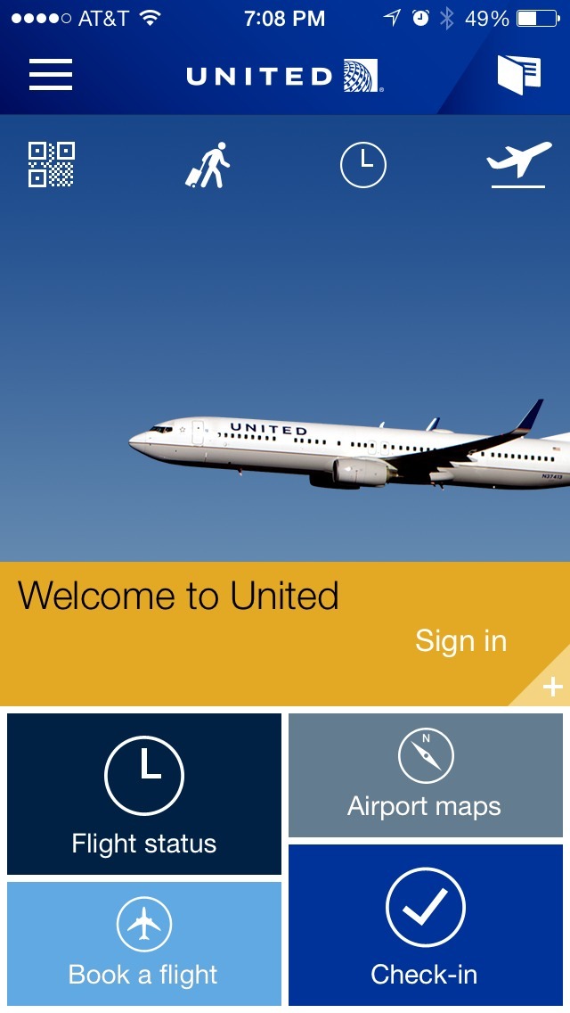
It is also good that United doesn’t force users to sign in when they get to the home screen after the intro.
To be improved:
The text on the intro screens is extremely verbose, and often includes multiple tips or instructions. This can easily overload (or be ignored) by people who want to get an at-a-glance overview of key features.
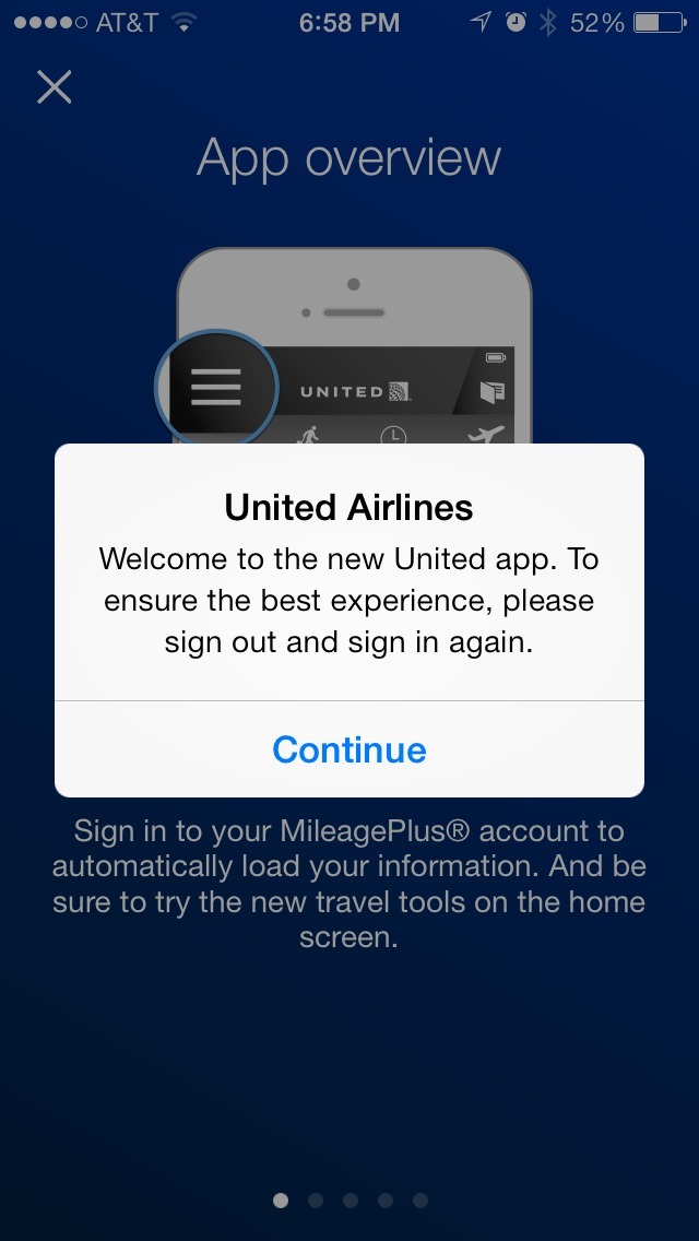
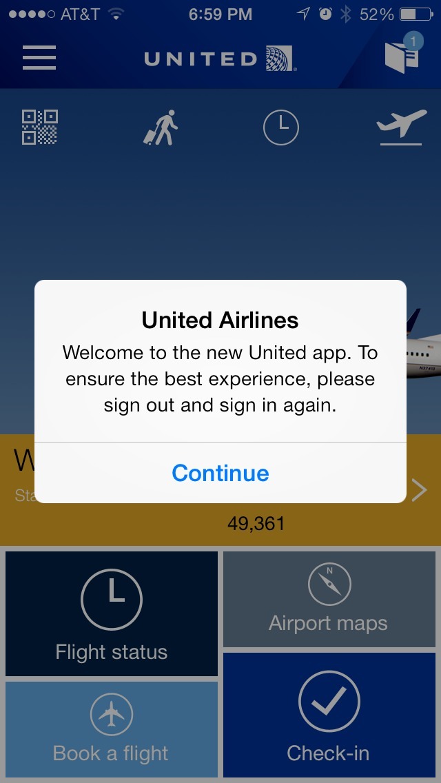
There was another issue that was frustrating, but would only be an issue to an existing user who upgrade to this newer version of the United app. Upon upgrade, I was shown a message asking me to sign out and sign in again for a better experience, and then I was repeatedly shown this message again and again until I went to the menu and selected “Sign Out” from the options. It very much destroyed the experience I had with the new version of the app, as there was no way from the message/prompt to sign out quickly.