
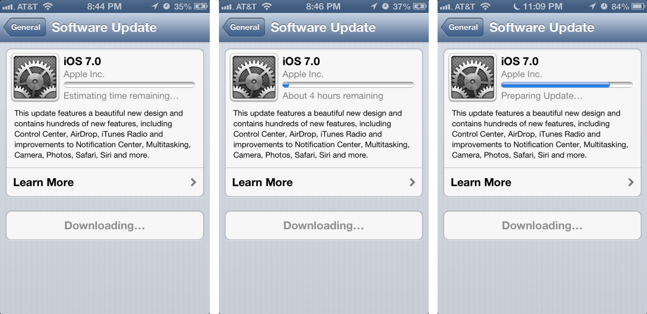
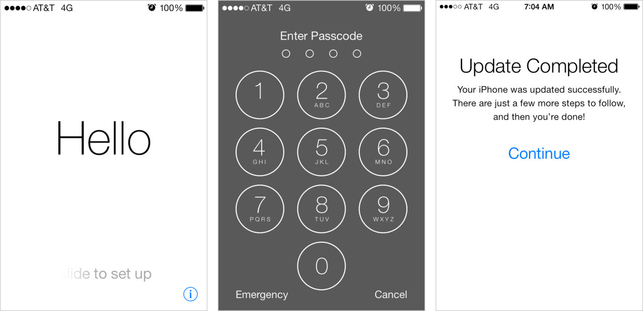


The above screens show the install and first-run experience of iOS7 on an existing phone. The first half of the experience is focused on downloading and installing the update; the second half is a modal wizard where there is an introduction, iCloud setup steps, and then a single modal popup upon re-entry to the home screen.
The good bits:
The use of human greetings like the “Hello” in various languages is a good opener for those about to dive into a few technical account details.
Once the setup wizard was completed, Apple very quickly dropped me into my home screen. Finally, the follow-up email in my inbox about the new Find My iPhone features was a nice touch. It didn’t require I stop to read something but provided helpful information.
What could be improved:
The download/unpackage experience was fairly slow. Yes, it is a modeless experience and I could play with an app while i waited, but it was still a time sink at 4 hours. And that extra confirmation step Apple requires when getting through their user agreements is unnecessarily repetitive. Both of these put me in a “jeez I just want to get started” mood by the time the OS installed.
The setup wizard after the OS installed seemed disjointed. Perhaps this is because only pieces of it are shown to people upgrading an existing device. That said, it became unclear at points what stage of setup I was in.
- There were no indications of how many steps were involved (“just a few more steps to follow” isn’t enough information).
- It seemed tedious because I was asked to reenter settings for Location Services and iCloud—data that should have been carried over to reduce my workload.
- There was inconsistency in options and terminology for choices on a screen: I was required to make a choice with Location Services; I could “Skip This Step” on the Apple ID sign in screen; I could select “Not Now” on security questions; I could “Continue” on the Find My iPhone screen; and I had to select “Get Started” on the last page.
- Finally, several sections were verbose and manual-esque. We know that users rarely read instructions, so how helpful was the snippet on the otherwise-useless “Find My iPhone in iOS7” screen? Especially since Apple sends a follow-up email about it later?
With all the focus on interactions in iOS7 I was disappointed that Apple used a modal popup to tell me about Spotlight moving. Don’t just tell me to swipe down, have me try it right there. It also seemed odd to message about this particular change given all the other changes in iOS7, none of which, except for the automatic downloading of apps, is messaged elsewhere. This is a downside of any contextual hinting as it requires you to make hard decisions about what is and isn’t included…without appearing inconsistent.
I look forward to reviewing this first-run experience again in the context of receiving a new device, when I imagine Apple’s packaging will lend a hand in a good first impression.