
The above screens represent the first time user experience of Pocket, a snippet-collecting app for iPhone.
The good bits:
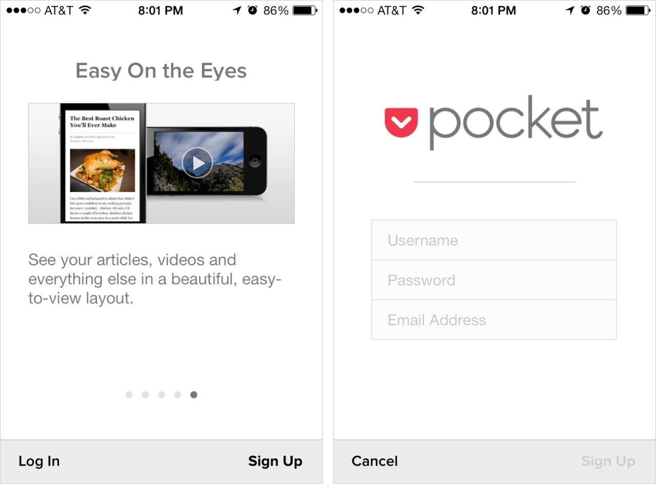
One good thing was that the sign up screen was short and only required 3 pieces of information.
To be improved:
This app unfortunately had a very long, verbose and non-interactive first run experience. Here’s a list of the areas involved and key issues with them:
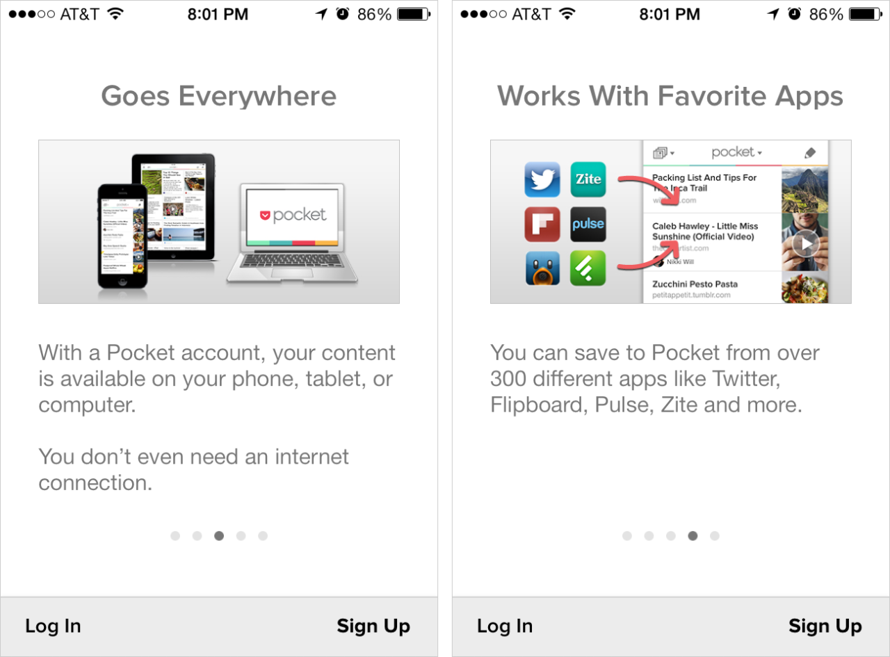
- There was an initial 5-screen product tour that forced me to sign up. There was no ability to skip this or view sample content.
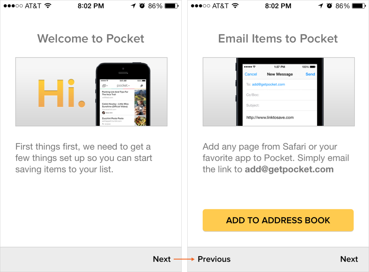
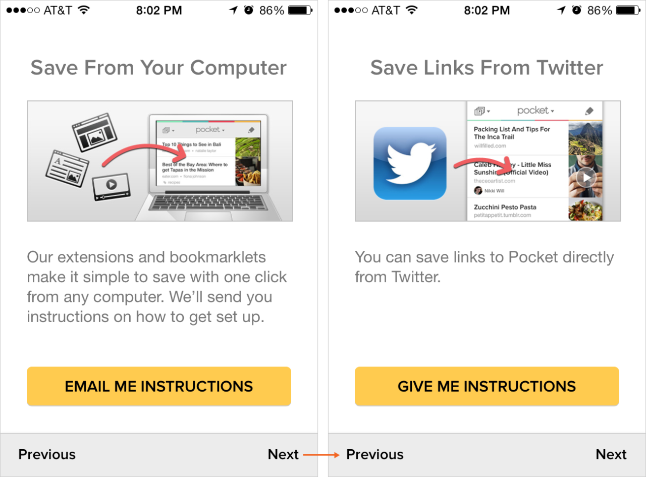
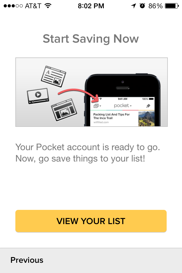
- After signing up, instead of being taking to the app’s primary screens, I was shown another 5-screen setup flow with instructions. The 2nd screen, with the option to add the email link to my address book, was useful. But the latter screens weren’t even required to get started. One screen offered to “email me instructions”—something that could have been done automatically since I provided my email during sign-up.
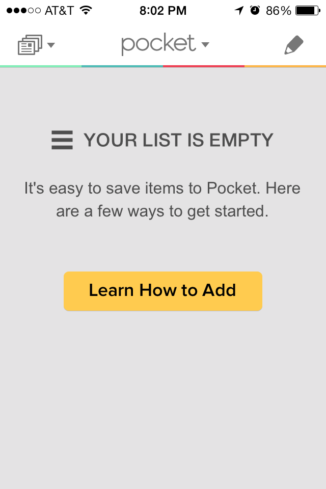
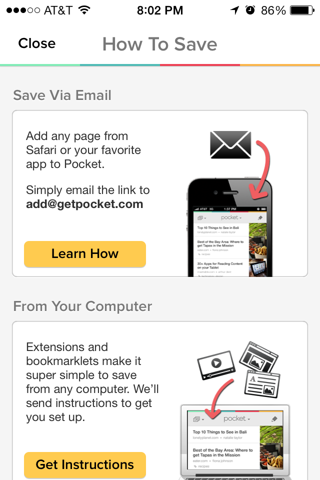
- After completing the setup flow, I was taken to an empty list. I had to tap on “Learn How to Add” and was taken to a redux of the instruction flow.
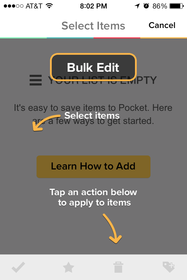
- Oddly, even though my list was empty, I was shown coachmarks about how to edit items in my list (to be honest, I’m not sure that this would have been necessary even if I had items in my list).
In general, this experience could have benefited from designing using the “Show Interact, Don’t Tell” principle.