


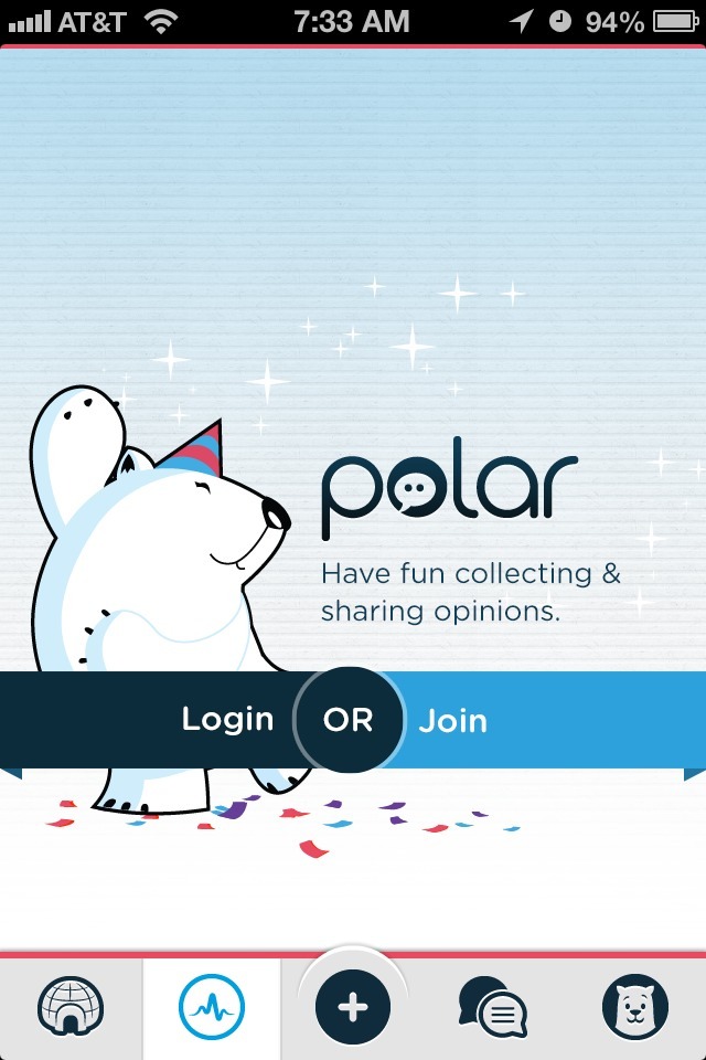

Polar app cuts right to the chase in its first time user experience. Instead of throwing up a tutorial or coachmarks screen, Polar uses a combination of inline and hint education to teach you about its polling capabilities.
As I scrolled through the various polls on the home screen, a few helper polls were displayed. They provided tips such as “Tell someone you love their poll by favoriting it” but didn’t distract from my browsing the content. These hints were also presented in the same way as regular polls, so they aided in reinforcing key interactions.
When I hit a stopping point, in this case the load-more area when I scrolled to the bottom of the initial poll set, a contextual hint popped up to teach me about removing polls I didn’t care for. This element took advantage of the time I was already going to have to spend waiting for the new set of polls to load in.
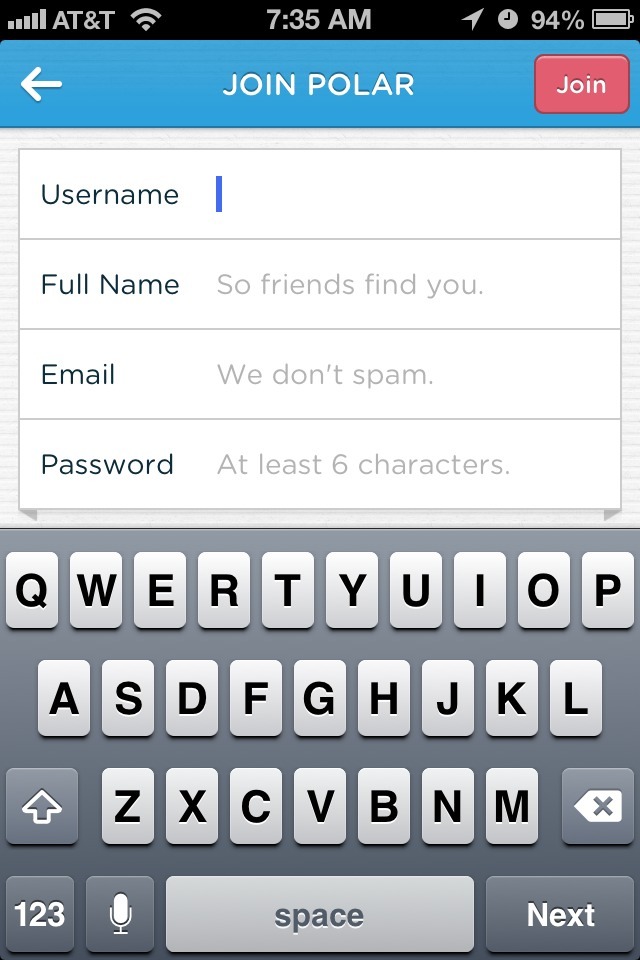
Other than the home screen, the remaining 4 tabs required an account to access. While the sign-up process is informative and fairly painless, and while it doesn’t get in the way of the initial experience, it was a little odd to have access to 4 areas that all showed the same sign-in prompt without more information about what those areas were for. That would be my only suggestion for improvement.