
AirBnB iOS app First Time User Experience
The good bits:
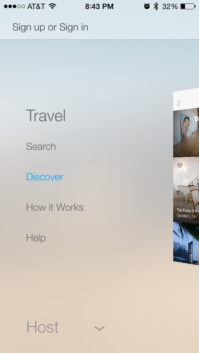
- The app allows users to skip the intro tour and browse listings without needing to log in to an account.
- There are no coachmarks or popovers that get in the way of a user who simply wants to find a place to stay.
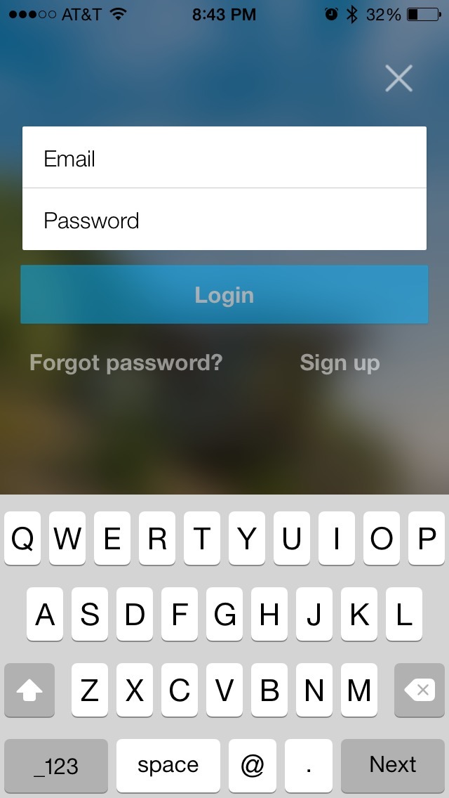
- Signing in is only prompted if a user wants to book a reservation.
- The user can re-access the “How it Works” intro tour via the app’s navigation.
To be improved:
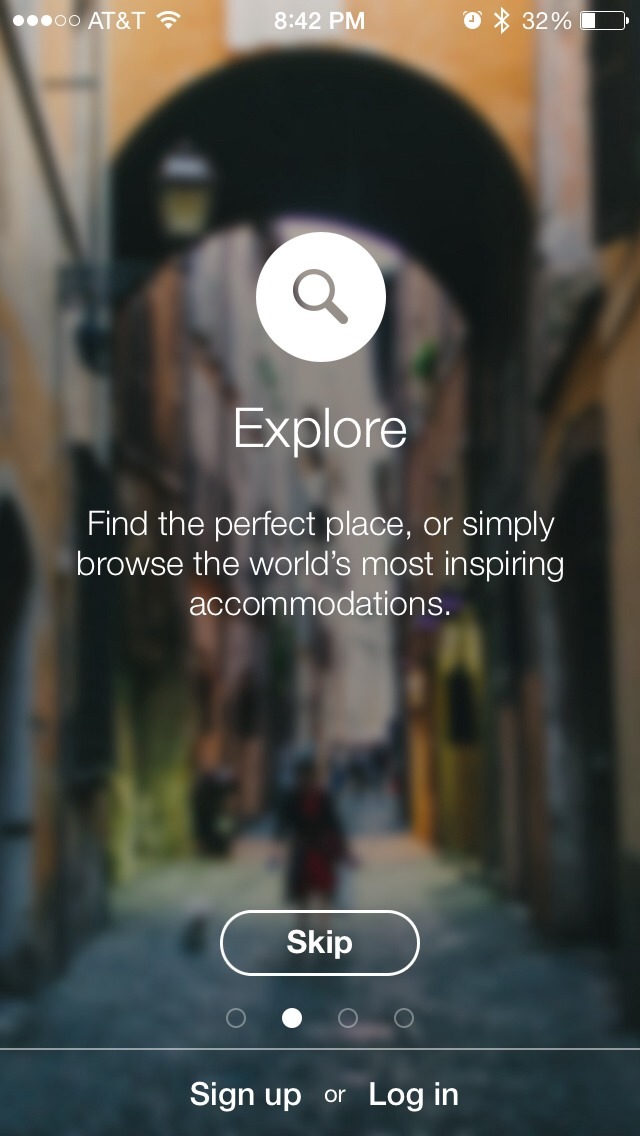
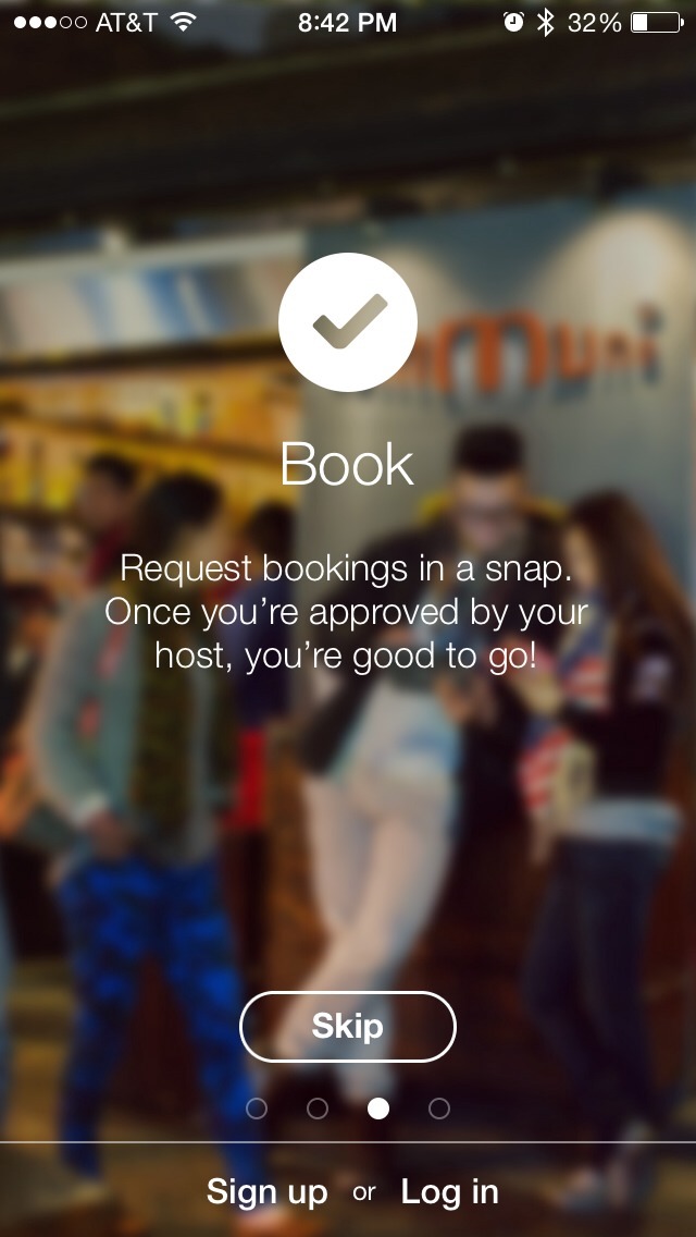
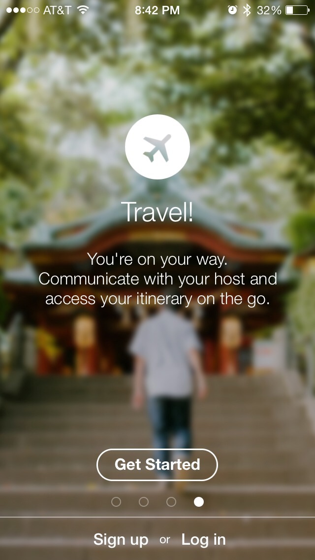
- The intro tour is more marketing-oriented than “How it Works”-oriented. I would suggest either reducing from multiple panels to a single panel with a list of 3 bullets plus sign-in, sign-up and get started prompts, or make the content on each panel more helpful. In some cases the text is informative, but is made difficult to read because of the noise of the photo behind it, and also because the photography itself is disconnected from the messaging. People will perceive the photos before they perceive the text, and may quickly pass these over because they assume the content isn’t related to how to use the product.