
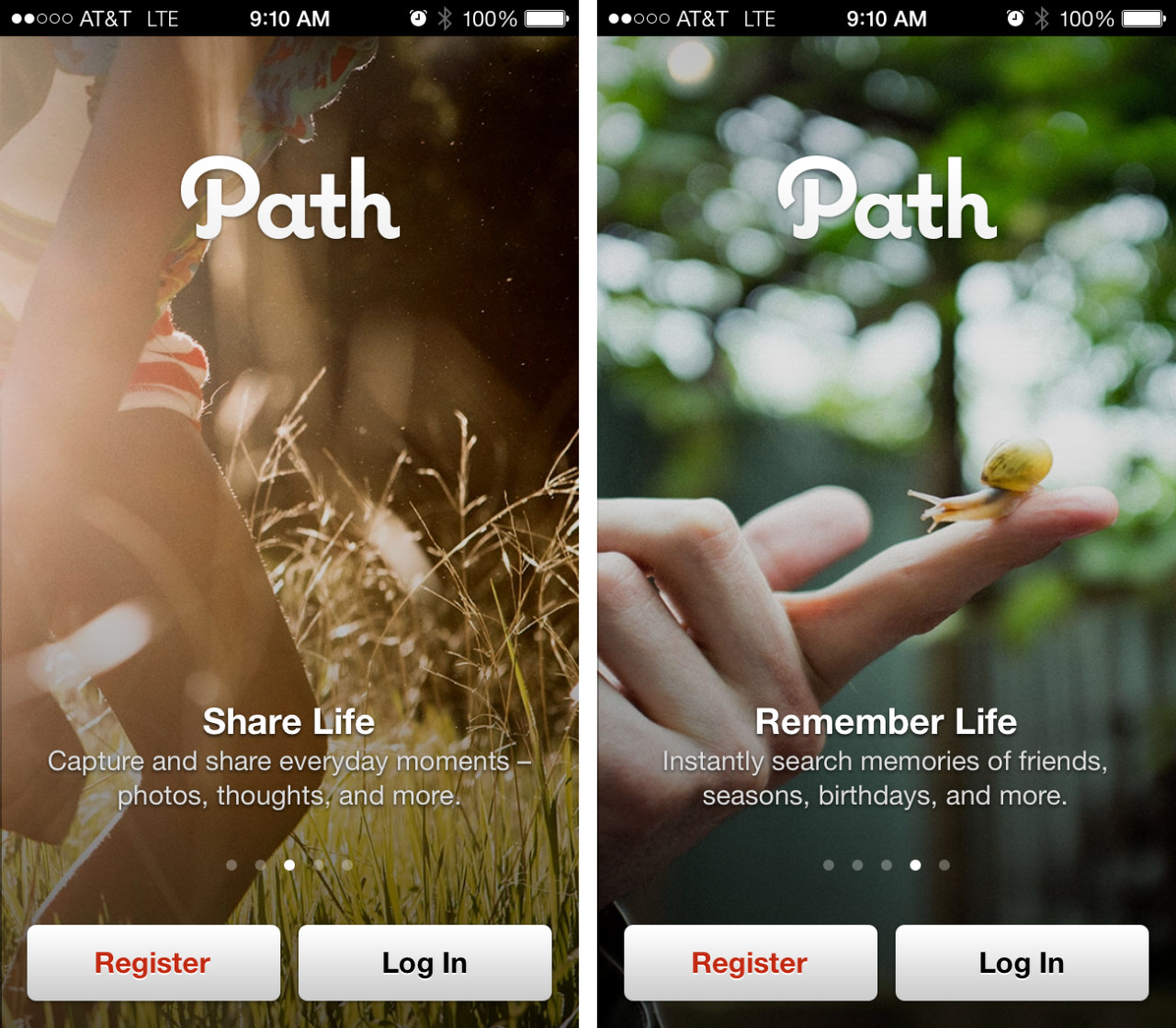


In my post on first time user experiences, I cited Path as a good example of showing sample content. Since then they’ve updated their onboarding flow, which is shown here.
The good bits:
A product tour is displayed at the start, but users are able to access the “Sign In” or “Sign Up” buttons on any panel so that it’s easier to skip ahead. The copy is very conversational and easy to understand.
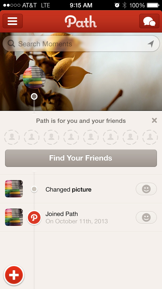
Once signed in, and even if no friends were selected during the onboarding process, the app shows you some examples of timeline content in the form of your own activity.
To be improved:
Path seems to have taken a few steps backward in their onboarding experience. The app used to show inline examples of comments, photos and more in a sample timeline (similar to Polar’s approach) and allow users to explore that content without being forced to sign in. Now they’ve instead focused on a longish product tour, forcing sign up/sign in before anything can be explored.
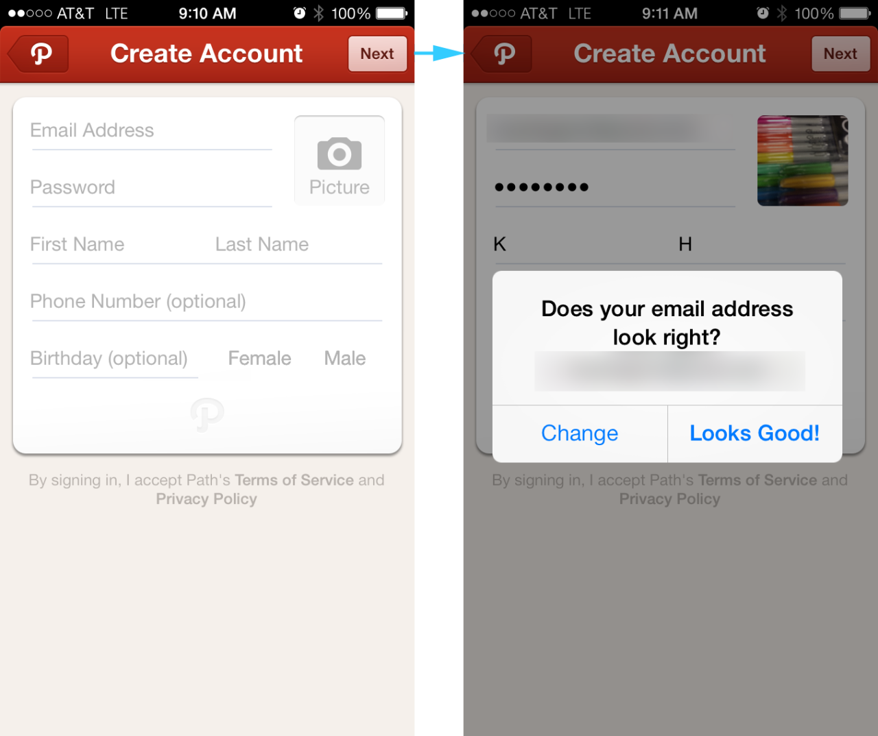
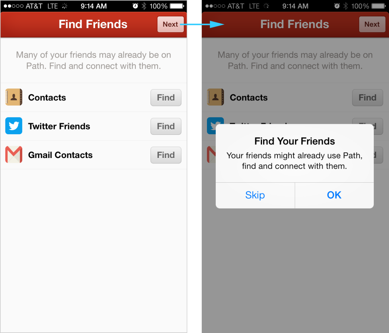
The sign up process seems to have increased in length. The confirmation prompt asking “does your email address look right?” can be frustrating. There is a fakeout experience when users see a hint of the app’s home screen under the Notifications prompt, but then they quickly funneled into an “Upgrade to Premium” screen followed by prompts about adding and inviting friends. Even though one can skip the “Find Friends” and “Invite Friends” steps, each requires an additional confirmation. Once finally landing on the app’s home screen, a prompt to add friends still dominates the timeline.