
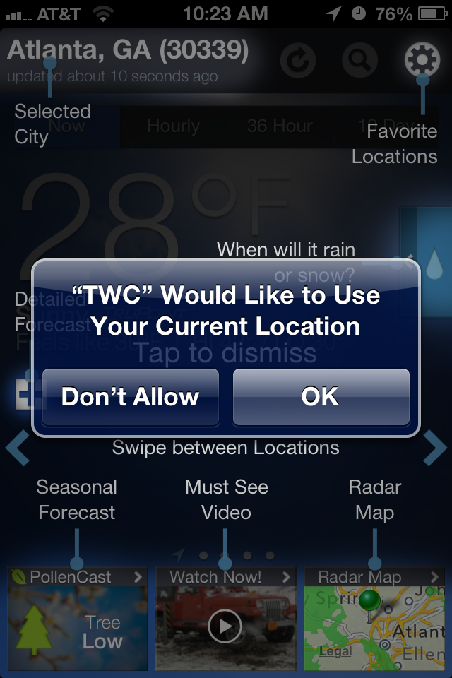
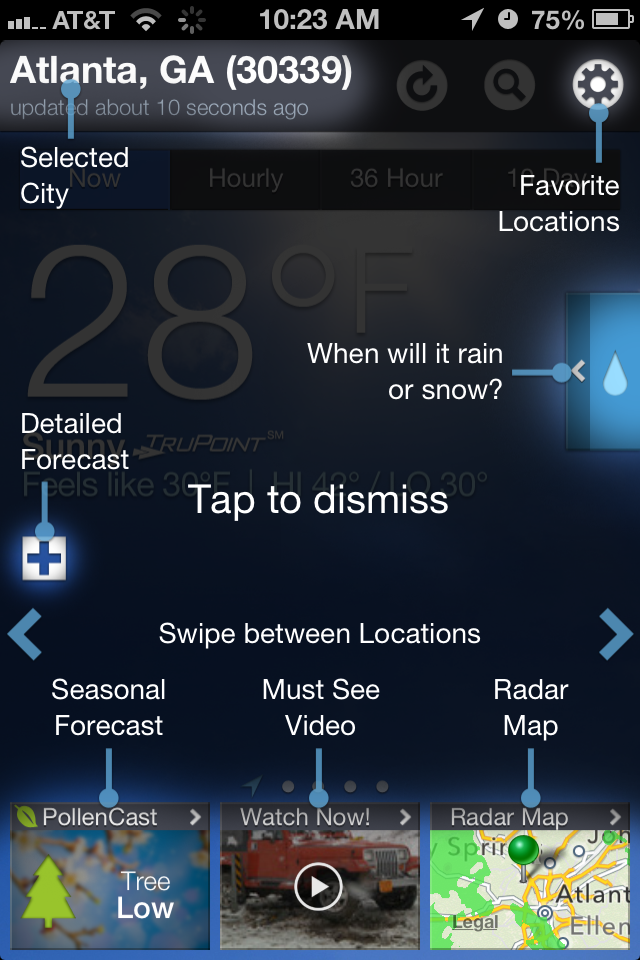
Holy coach marks, batman! This is the first time user experience for the Weather.com app for iPhone.
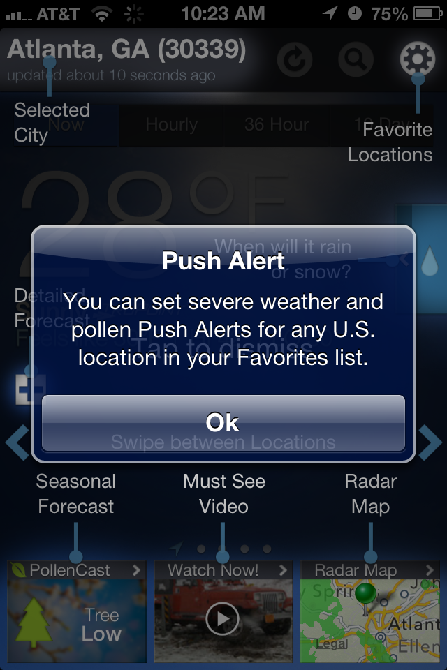
First it displays 3 modal alert dialogs. The last one is an example of a push alert you might receive during severe weather, but I’ll admit to having thought of it as a buggy alert and I almost dismissed it without reading.
These alerts are followed by the coach marks. I’ve got an exercise for you: Look at the coach marks for 5 seconds, then dismiss. How many of those instructions can you recall? Two things make coach marks difficult: the number and variety of instructions, and that they block the underlying screen (which isn’t even representative of the actual content that will appear below them).
Users have limited capacity for remembering a wide variety of information presented out of context. The more different the two screens are from each other, the less likely it is that someone will remember all the differences. Maybe the Weather.com app should focus on teaching the user key actions they wouldn’t be able to figure out on their own, whereas calling out special content—like Seasonal Forecast, Must-See Video and Radar Map—should be a bit more self-evident. Finally, they should be able to load the current forecast screen underneath the coachmarks display so that there won’t be as much of a difference when compared to the regular home screen view.