Dating products are interesting to look at when talking about onboarding experiences, because both concepts are built around first impressions.
The good bits
- Website: The Zoosk website provides a free sample by giving potential new users an opportunity to browse public singles in major metropolitan areas. This visibility starts building trust and can give the new user a reason for signing up with the service. Similarly, there are region-specific dating ideas and dating group links.
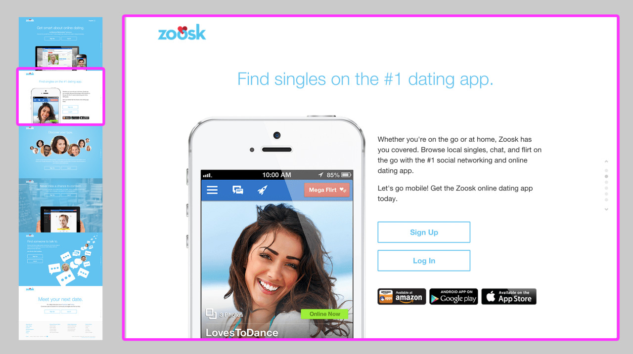
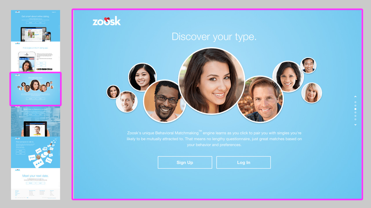
- Website and app: While the Zoosk website and app both greet the new user with intro tours, they at least makes the sign-up / log-in actions available on all screens. This way, the user doesn’t have to swipe through all screens just to move forward.
- Website and app: Each offer the user a focused playthrough after he signs up and creates a profile. The playthrough allows the user to experiment with the messaging tool without risking sending a message to someone he doesn’t want to pursue. It also has a lightweight personal focus based on the user’s gender selection in the profile wizard; for example, if the new user selected “Man seeking man,” the playthrough displays illustrations to suggest men. The playthroughs are consistent between mobile and web, being tightly focused on 3 areas of the interface.
To be improved
- Website and app: Both force the new user to opt in to a number of policies (Terms of Use Agreement, Electronic Records Terms and Privacy Policy) when he signs up, which can be daunting especially before Zoosk has proven its abilities.
- Website and app: Both show intro tours that are padded with marketing phrases and obvious statements (”Let the #1 dating app set you up” or “Find someone to talk to”). The major feature Zoosk seems to be promoting, its Behavioral Matchmaking tool, gets buried among all of these other messages. It might be better for Zoosk to surface only this feature in an interactive demo that potential new users could play with, even with sample content.
- App: The app provides no free sample to the new user, unlike the website which lets not signed-in users browse singles by major metropolitan area.
- App: The mobile app asks the new user to grant it notification and location access before showing how that access will be used.
- Website and app: The new user has to participate in a 7-step wizard to set up a profile. He cannot skip or mark any answers as “prefer not to respond.” Even though this is a dating product, some questions are very personal and it is too early to demonstrate to a new user why the answers may be useful. Zoosk could instead consider gradually engaging the user to provide more information over time (after he’s had a chance to see how other singles value that information).
- Website and app: While in the profile setup wizard, there’s no way to go back to a previous question and change a response.
- Website and app: The new user is forced to participate in the playthrough; there is no skip option. I usually commend the use of an interactive playthrough as a replacement for less interactive models like intro tours. Here, the playthrough feels like more forced work because it comes after an intro tour and a setup wizard, and also because it is not skippable.
- Website and app: If the new user first participates in the playthrough on one platform–say, the mobile app–and then later signs in to another platform–say, the website–for the first time, he is forced to repeat the playthrough on the new platform. Instead, completion of the playthrough on one platform should be saved with the user’s profile and prevent it from displaying again on a new platform. The differences between Zoosk’s mobile and web interfaces are not enough to require a new user to go through the playthrough again.


