
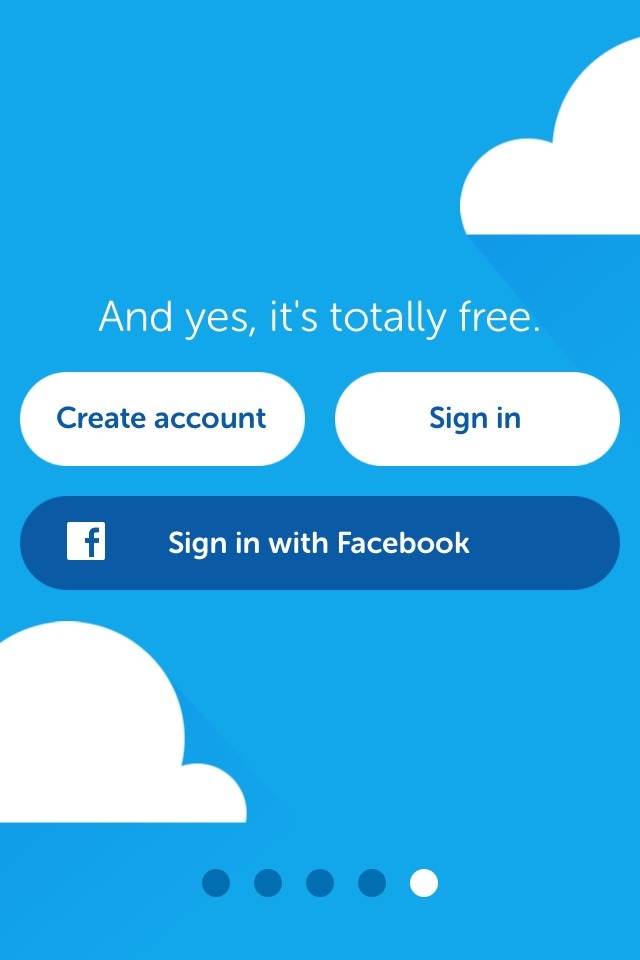
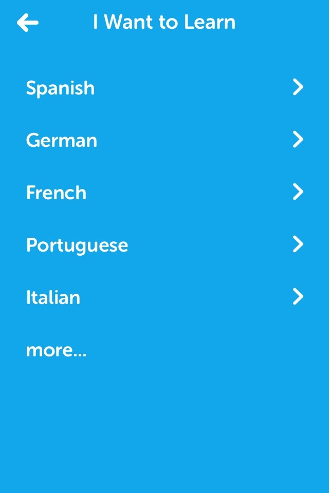
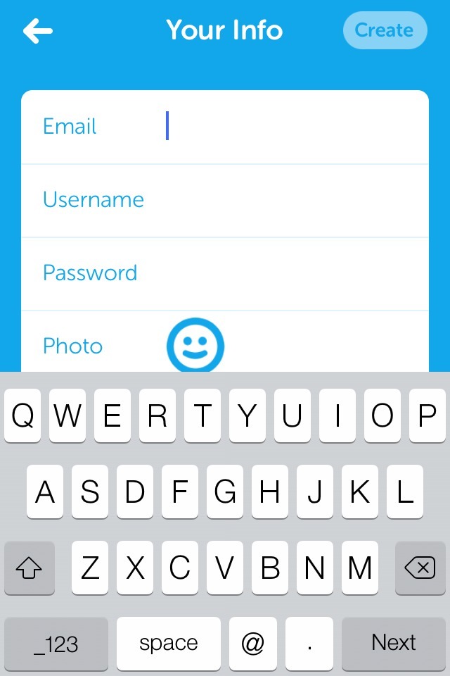
The screens above are from the first time user experience from Duolingo, an iPhone app geared around teaching users a language for free.
The good bits:
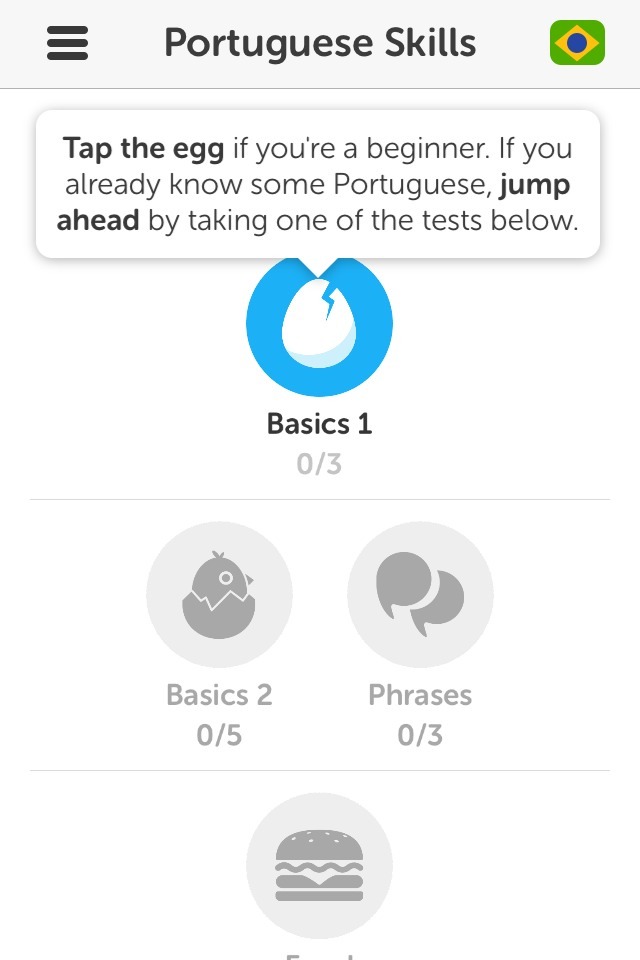
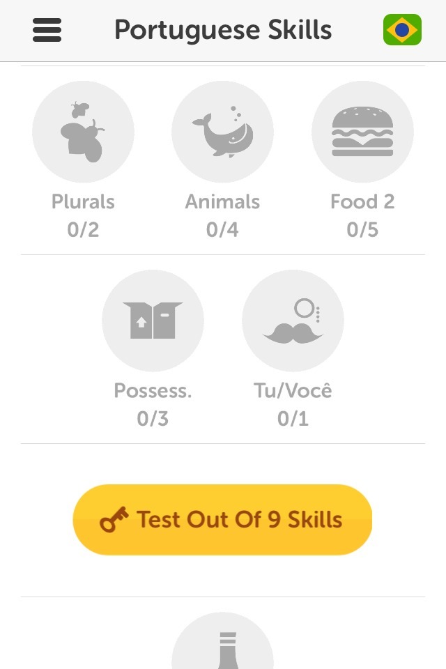
Once I was past the initial hurdle of the product tour/sign-up wall, I found that the app had visually laid out the full curriculum for my chosen language. New lessons were represented by gray icons that showed me the types of words/skills I would learn. I could also see the breakpoints where I would be evaluated. This “roadmap” clearly set my expectations for how much time I might need to invest in learning the language.
The app also allows students with more advanced skills to skip ahead by taking one of the tests. This is a great way to let different people start from the place that’s right for them.
To be improved:
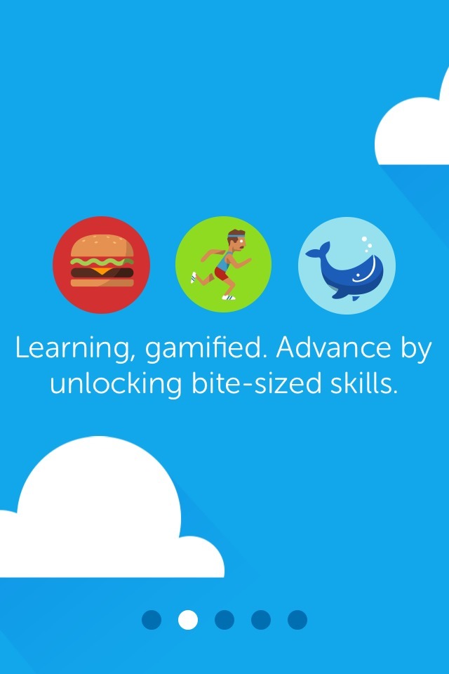
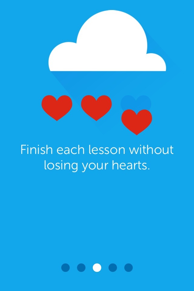
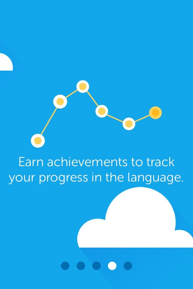
Especially after seeing how clearly the curriculum was laid out, the initial product tour feels superficial. It doesn’t provide any helpful information about the app (phrases like “finish each lesson without losing your hearts” are particularly nebulous). Given how clearly the lesson plan was set up on the app’s home page, I think this could easily have been skipped.
The need to create an account before seeing the lesson plan is a large barrier. I would suggest the app allow users to begin the curriculum before creating an account, then prompt them to sign up after they finish a lesson or take a test. Progress can easily be saved locally. As a side note, once I registered I received an email that directed me to Duolingo’s website to see “extra features”, but all I could do when I arrived was sign in.
Finally, I wasn’t clear when I downloaded the app why it needed push notifications, so I automatically turned those down when greeted with the prompt.